Logos and Branding


BOLD Goods is a brand new, ongoing project for a good buddy of mine! With this logo suite, his dream is to unleash an encouraging, Kingdom-minded movement through art and apparel. It was a fun challenge to create a super simple icon loaded with meaning (a Luchador Fighter meets Peace Dove), while being able to freely rearrange the color palette and logo composition as needed.

This logo was tailor-made for my wife Miriam! Empowermenu is meant to represent her passion for eating healthy, spending smart and living empowered - all while inspiring others to do the same. This was an absolute honor to put this together for her!
This is a title logo for a message called "Urban Legends", for Rolling Hills! The topic is about dispelling certain myths about God. Way cool. For the look, they wanted something modern, compelling, and even a little mysterious. This was such a fun assignment - so fun in fact, I had a blast developing this concept too ;). Check out all of the design elements for this one here!

"The Narrow Gate leads to a wide life"! It was an honor to partner with the lead pastor of Valley Creek to create this brand, and I could have never anticipated the impact it would have. Tap here to check out 7 years worth of VCC icons that were tailored to support various messages, events and videos - while still staying true to the brand design itself.

This is a brand I put together for my parent's business, Castle Hills Real Estate, and it's still going strong! This mark can be spotted on "Sold!" signs all throughout one of DFW's most thriving neighborhoods.

For this design, my client wanted me to incorporate a sculpture that represented his family. Love the personal touch! As the logo was being developed, it was exciting to see the top of the statue emerge in the negative space of a connected "JTI", as well as the top of a dollar sign to subtly reinforce the business model.

I created this logo in support of John Stickl's book called "Follow The Cloud". It was used on various promotional items like a journal and a t-shirt to help get the word out.

It was an absolute thrill to be asked by Donald Driver (all-time leading wide receiver for The Green Bay Packers) to put a logo together for his new fitness venture, DrivenElite! Donald has been one of my favorite clients for one of my favorite logo projects to date. #GoPackGo

This is a logo advertising an English class taught by an amazing client, Rolling Hills Community Church! I really enjoyed this project (which had a pretty tight turnaround), and I’m even fond of the additional comps!

Pathway is a series of four classes, each built upon the other, to help visitors get connected at VCC. Previously, I had designed a different logo for each class, but as we re-branded the church, we felt it best to simplify things with one mark - and this design was the solution!

With my personal brand, I wanted a clean, punchy and versatile look — a mark that I could throw on everything from AbC ads and merch, to the upper right corner of a project presentation. I’ve had this brand since AbC’s inception, and it keeps getting more special to me the more I use it. I’d love to do the same for you. Contact me about your branding needs, and let’s get it going. The best is yet to come!


Below are a some examples of my favorite brand identity graphics kits. More to come!

Beast Donuts

No tricks, all treats with my concept work for “Beast Donuts”! The brand that almost was, but could still someday be ;). I’m still really proud of the logo design exploration and icon illustrations, along with the Mood Board that supported my bizarro brand proposal. Special thanks to @corwinbeverage and @bananawonder for the opportunity!

“Beast Donut” Flavor Icons


The Healing Place

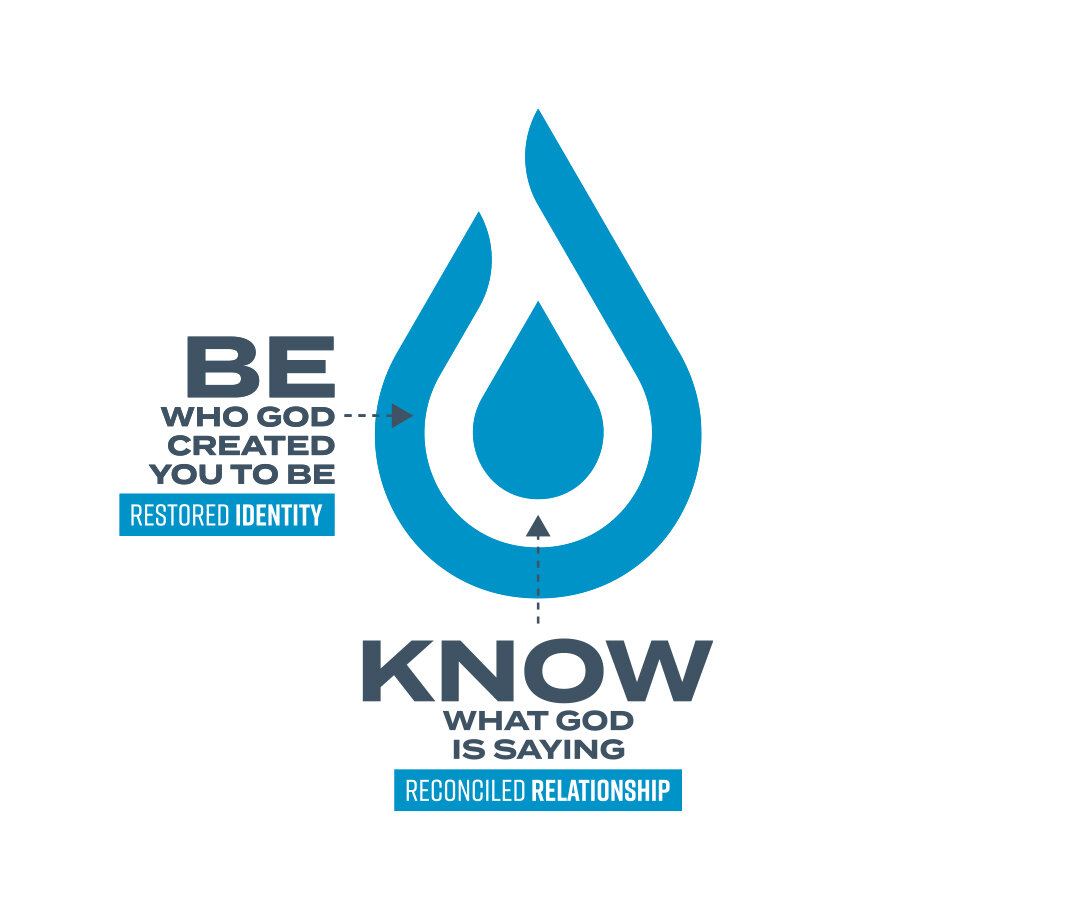
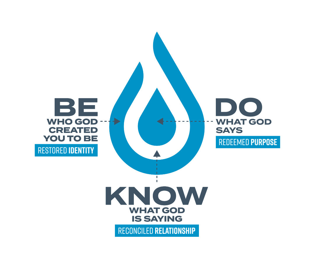
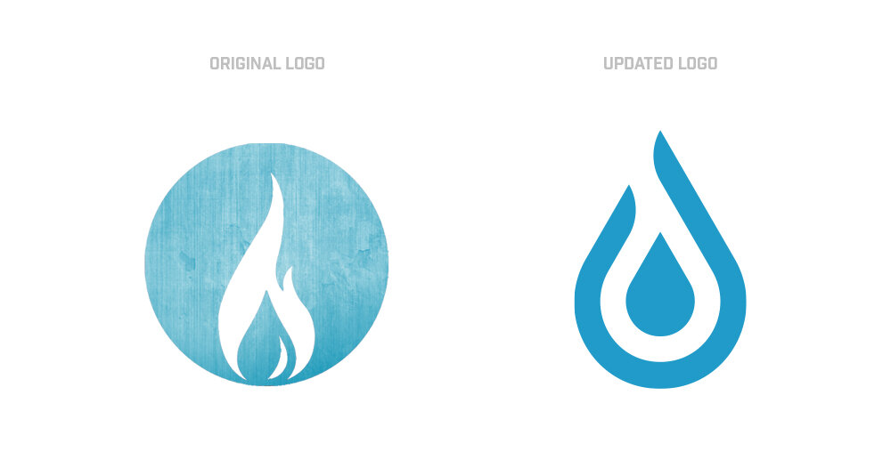
This rebrand is for The Healing Place (based in Shreveport, Louisiana)! I’m honored to have been entrusted to help breathe new life into their signature “Flame Drop” icon by streamlining the previous design, and then ultimately identifying the church’s “Be, Know, Do” philosophy within the icon design itself.


Construction Bros. Podcast

If you hang around the hardware store on a regular basis, this podcast is for you. I had the awesome opportunity to build out a graphics kit for Tyler and his brother Eddie to help lay the foundation for their new podcast “Construction Brothers”. Check them out on the usual platforms: Apple Podcasts, Spotify, Anchor.fm, you name it. Just like these dudes, if you’ve got a pro/passion project that needs some creative love, feel free to reach out, and let’s get to work.


Browar Polska

Cheers to one of my favorite assignments to date from Corwin Beverage - the refresh of the “Browar Polska” logo! I saw a great opportunity to add some color and streamline the design, while still treating the update as an homage to their original mark.


Holy Ghost Notes

Matt Greiner (kit-shredder for August Burns Red) and Tim Anderson have a Real Talk podcast about drums and God called “Holy Ghost Notes” — and they’re not just talking, they’re putting it into action. The guys threw an event called “Beating Drums to Battle Cancer” to help raise loot for 5 year old Makenna, who’s currently in the fight. I was so inspired by the heart of these dudes that I decided to make these graphics to help spread the good word.


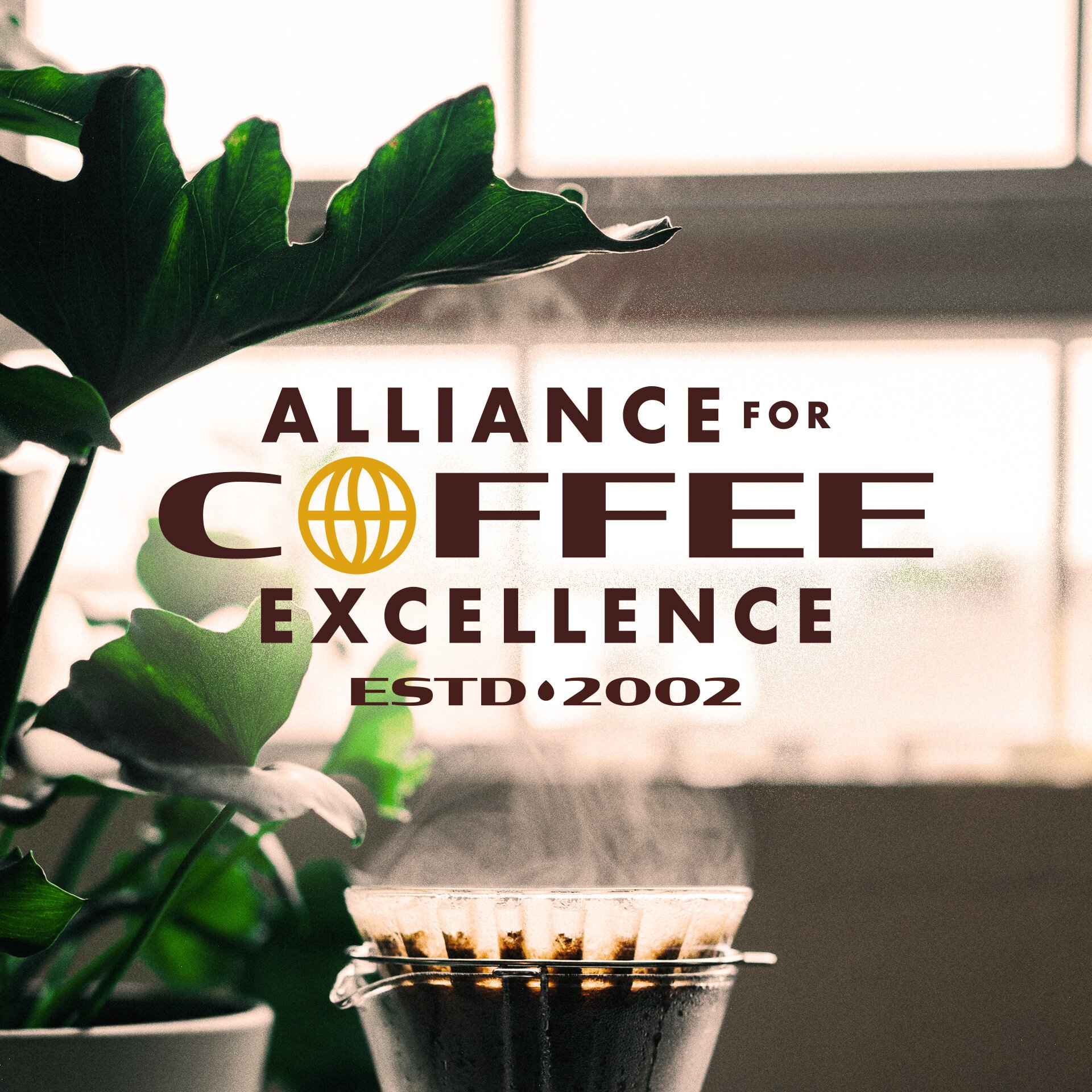
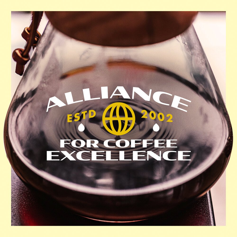
Alliance for Coffee Excellence

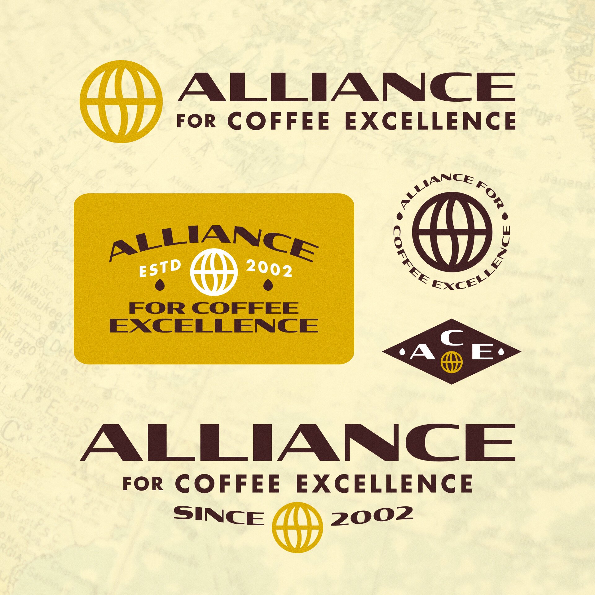
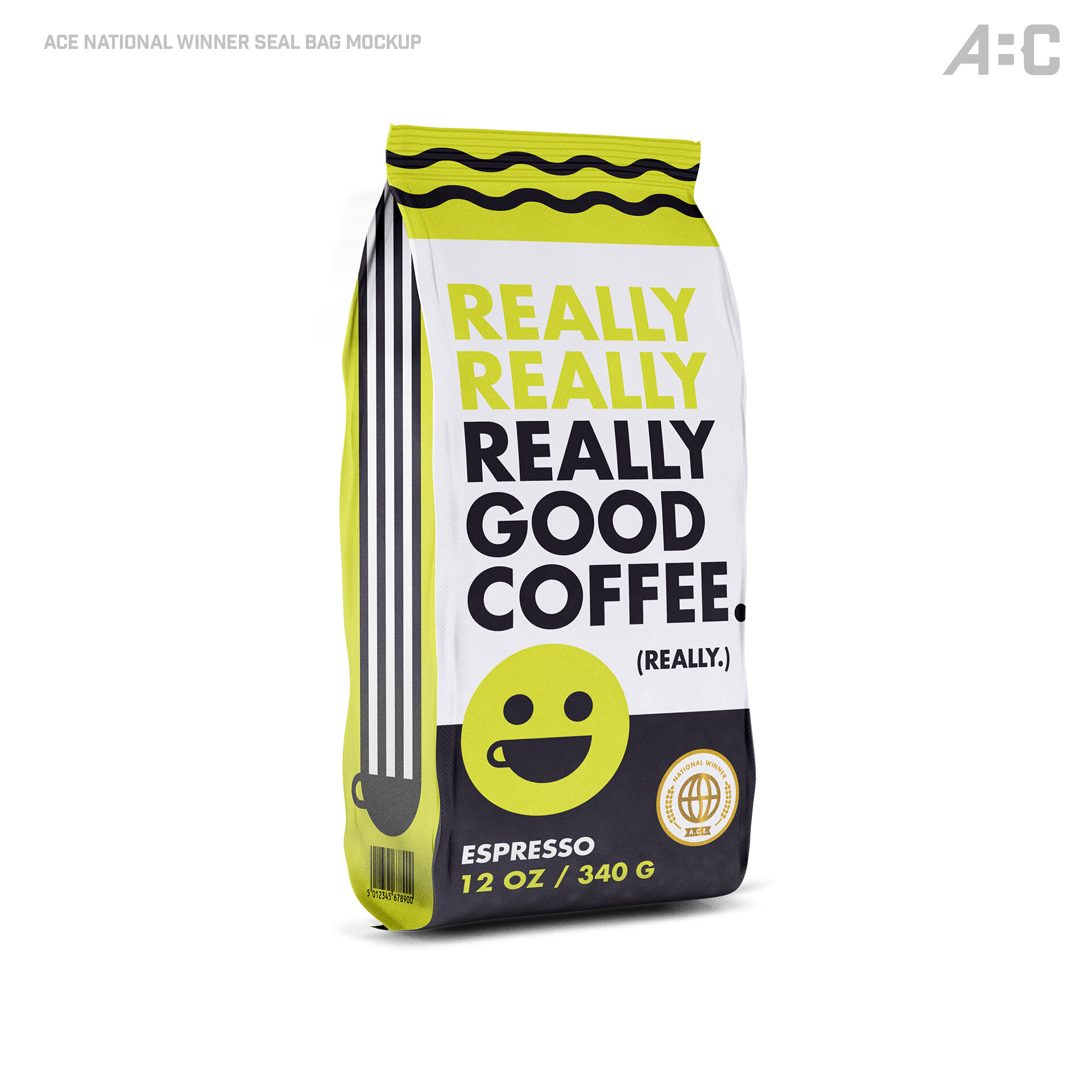
If you’re looking for the world’s best blends, just ask these folks. For this rebrand, I was asked to give the ACE logo a more refined and modern treatment, while also leaning on some vintage “Pan Am” vibes. This approach is meant to speak to ACE’s global influence within the coffee industry, and to their support of hardworking coffee farmers worldwide. Cheers!

BACK


You can stay up to date by following @artbycollin on Instagram!