ILLUSTRATION
“Working with Collin was easy and thorough. He’s willing to go the extra mile to get the client exactly what they’re looking for!”
AUGUST BURNS RED
Thrilled and honored to have created this official artwork for my favorite band August Burns Red! Since c.2008, I’ve jammed all of ABR’s records and watched these guys rip live (and livestream gigs in 2020/21!) countless times, and I proudly rock their merch on the regular. Beyond grateful for the opportunity to now be a part of the ABR camp with this contribution. More to come!
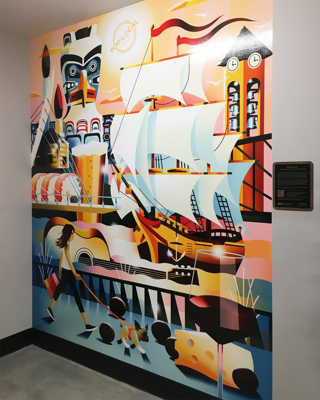
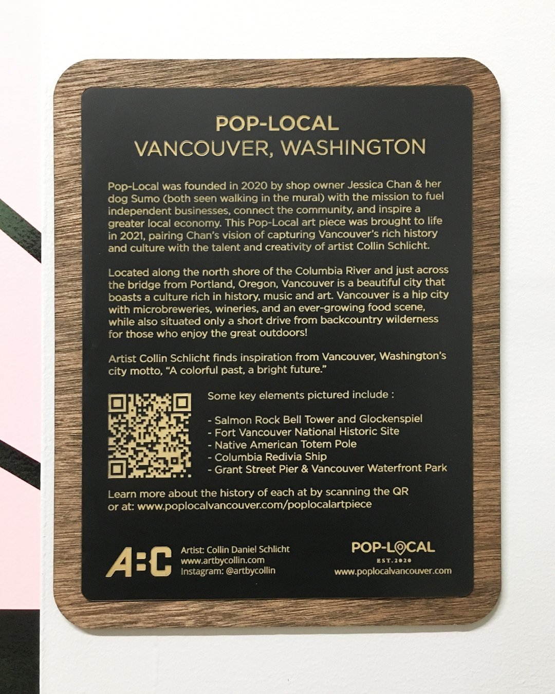
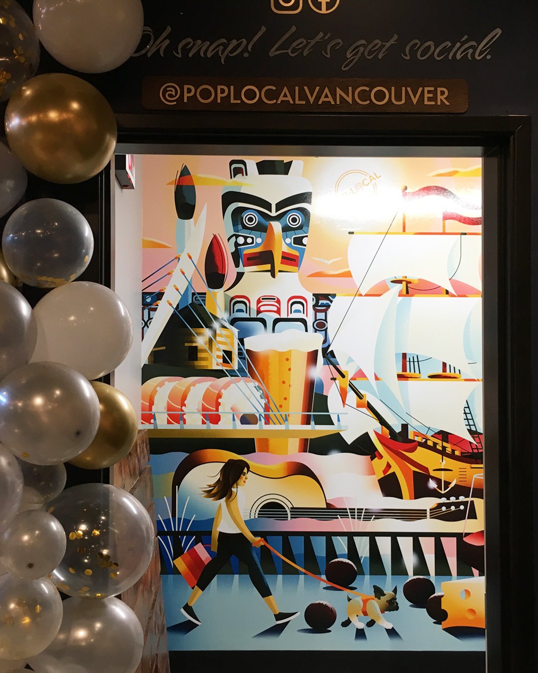
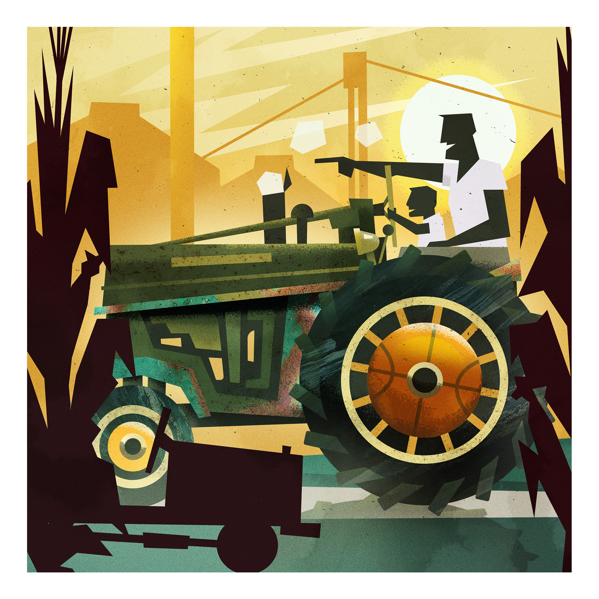
A Colorful Past, A Bright Future
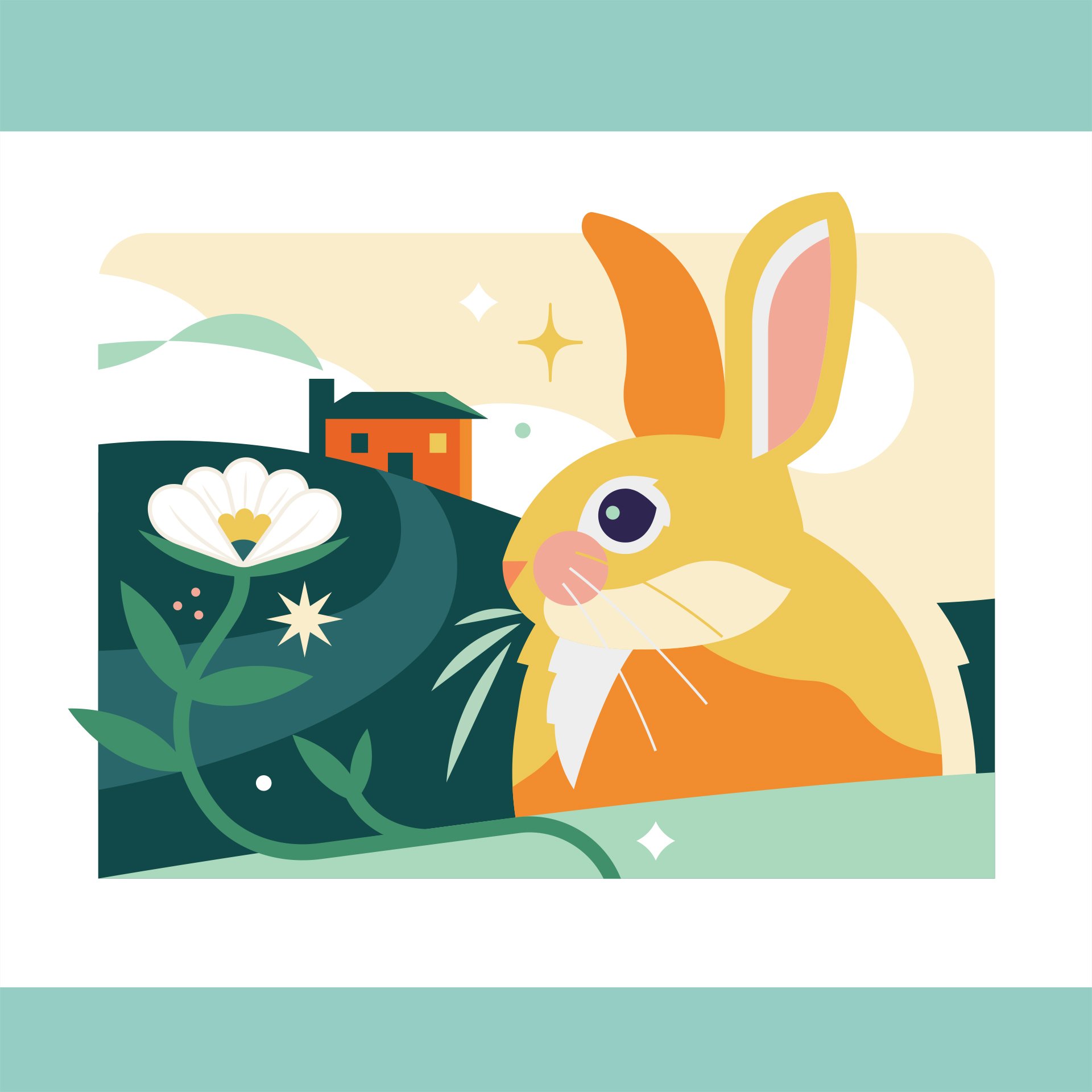
It’s officially poppin’ at @poplocalvancouver and I’m super grateful to have created this mural artwork (my first) for the shop! This one goes out to the local artisans of Vancouver, WA, the rich history of the area and the greater Pacific Northwest.
Huge shout to Pop-Local shop owner Jessica Chan (and her pup Sumo - both featured on the artwork) for the gig. Thanks for supporting local artisans!
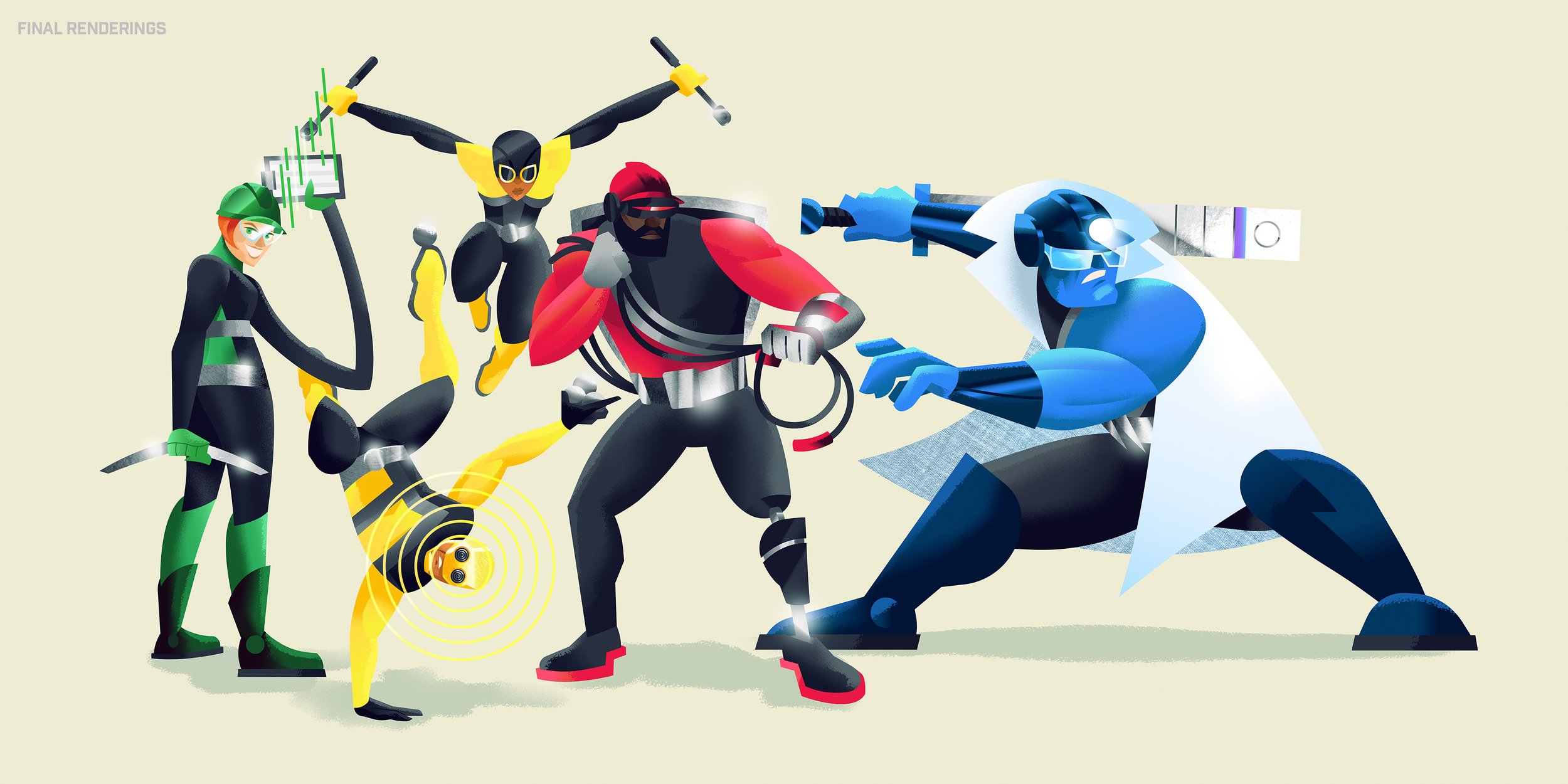
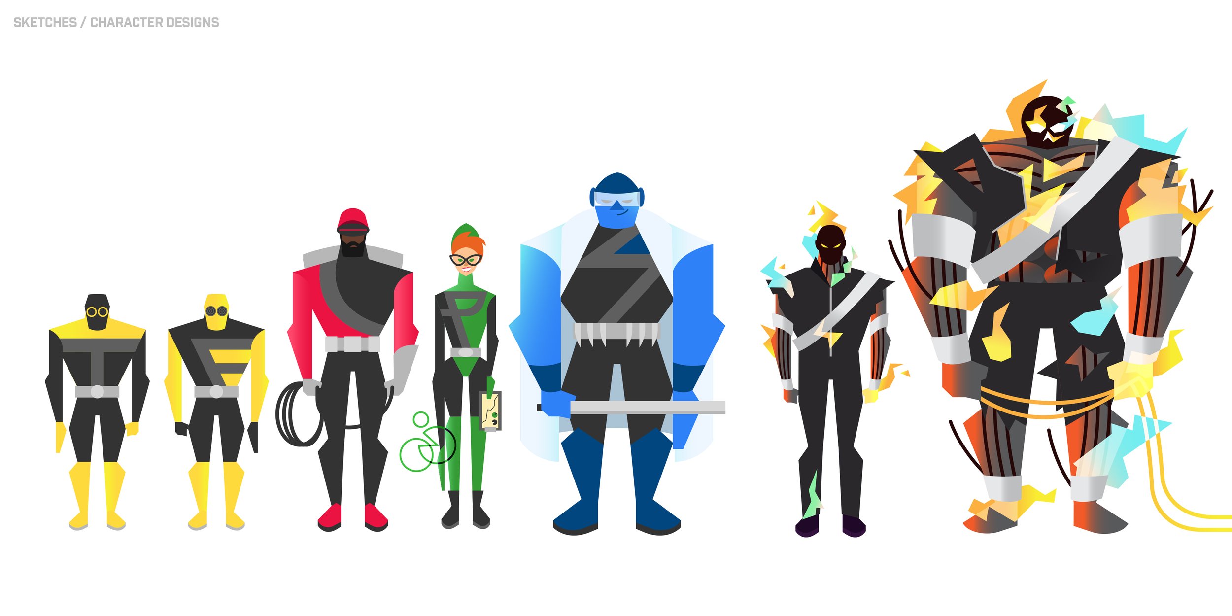
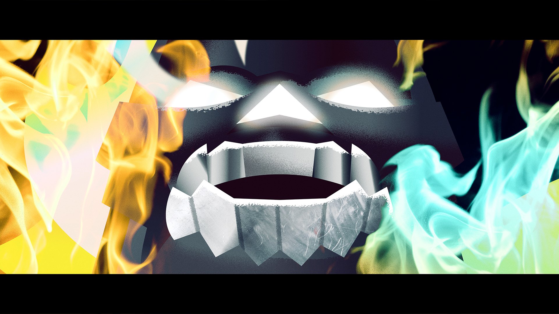
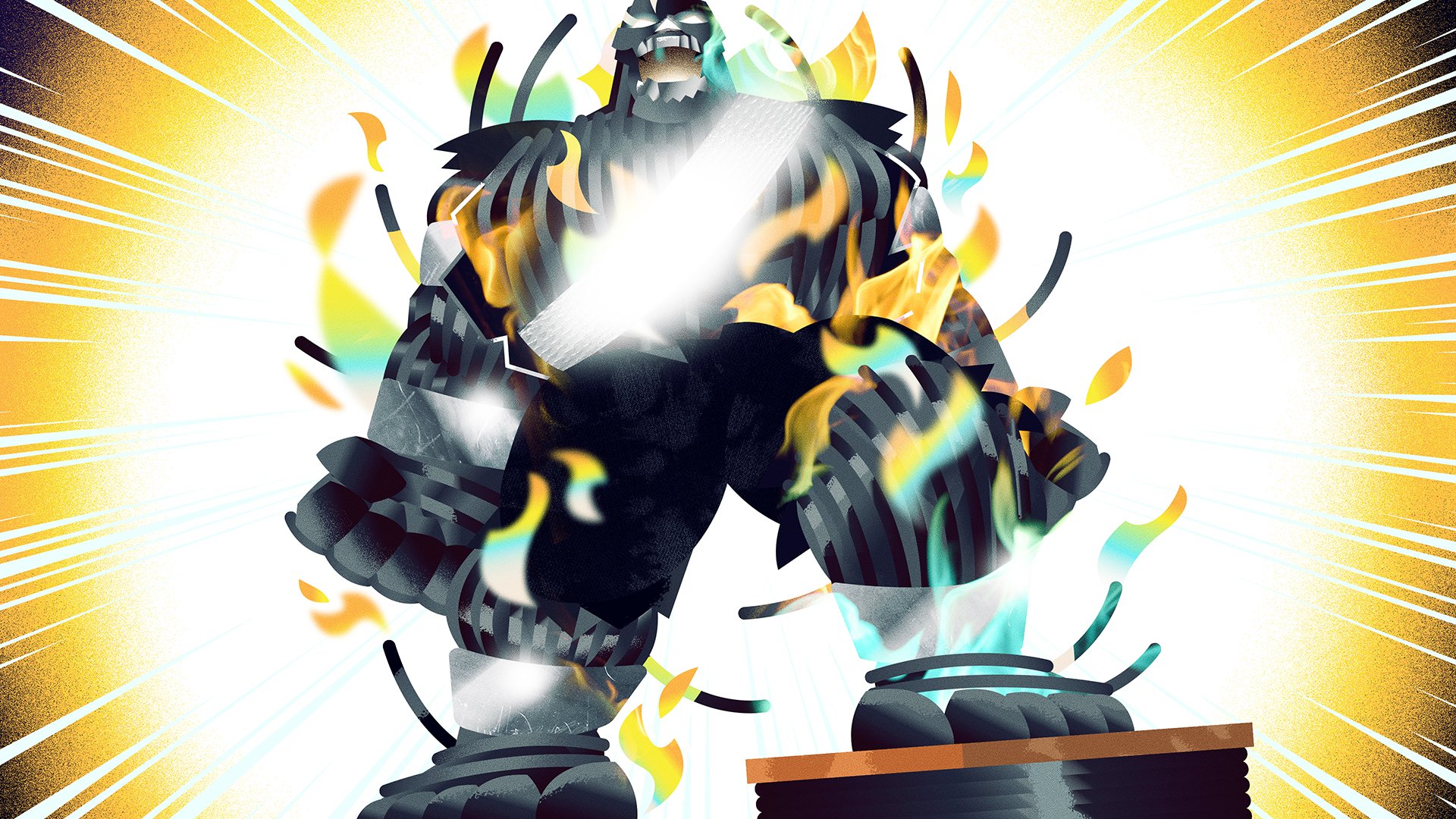
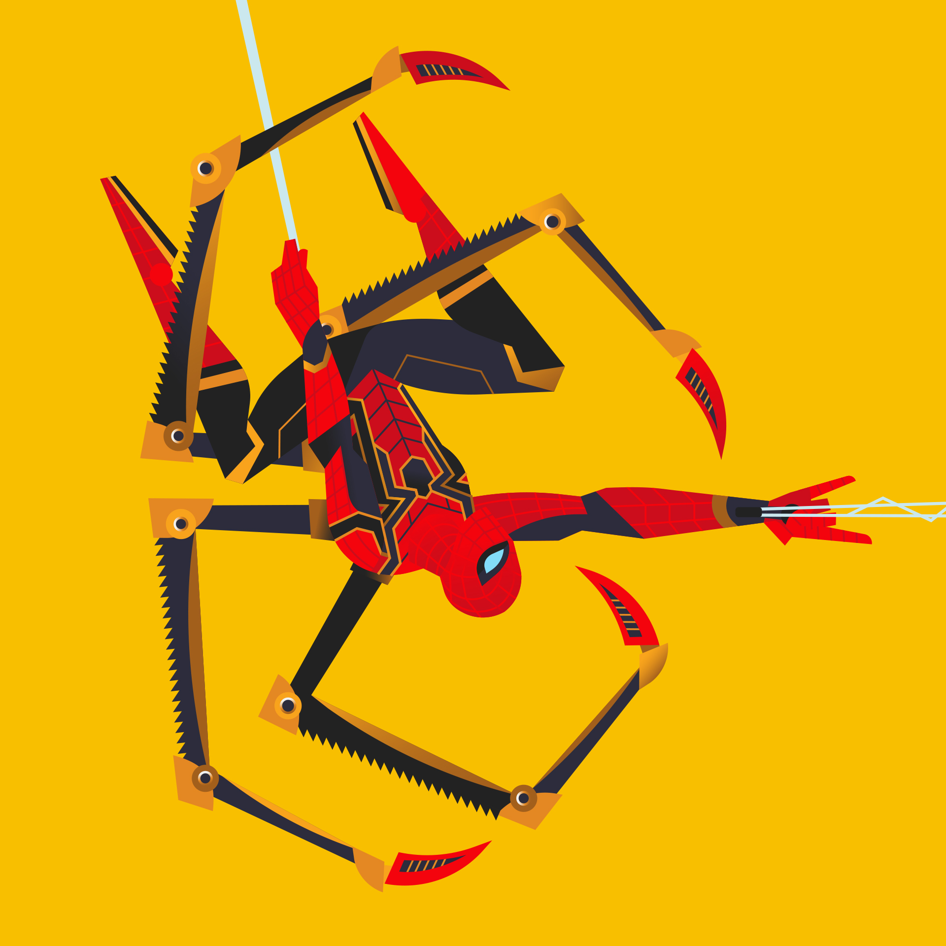
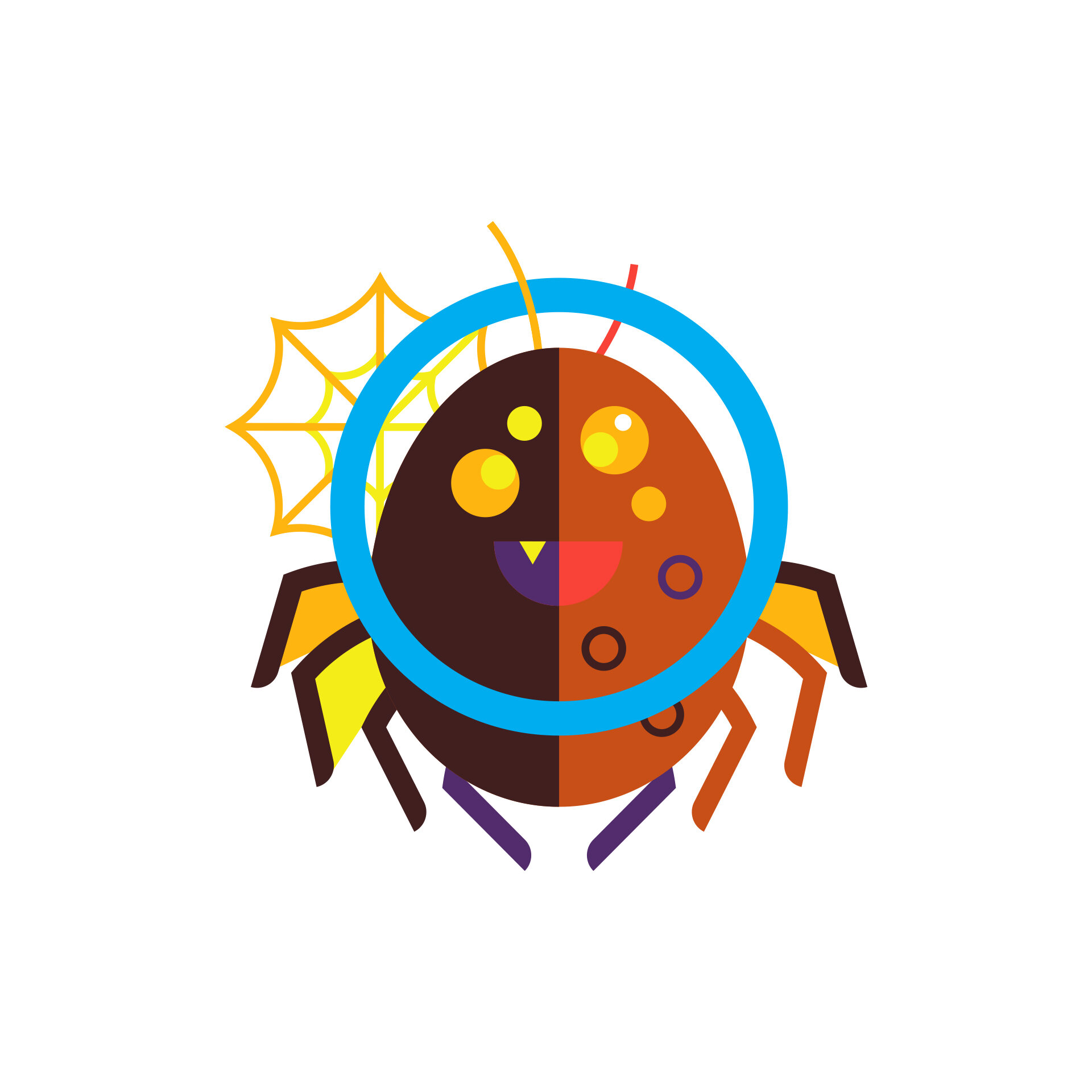
VOLTAGE LEAGUE
What a blast to be able to come up with the look of a group of Superheroes (and a Supervillain!) to help raise awareness about the safety procedures of a great company…all for the betterment of those who keep it running smoothly. Thanks for the awesome assignment, AHA. Voltage League…charge!
“It was a challenging assignment; the content was dry and complicated. The illustrations Collin provided were full of the creativity, humor and polish we were looking for.”

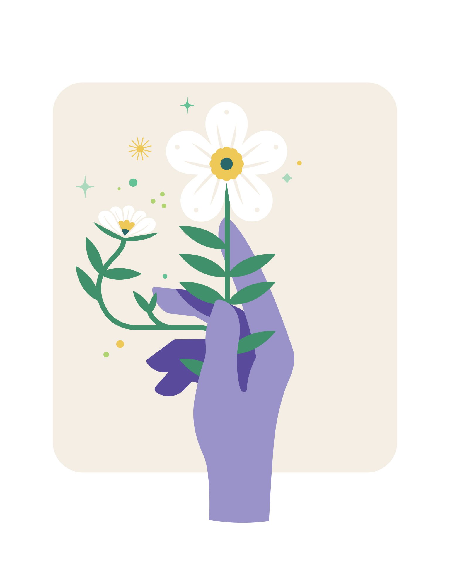
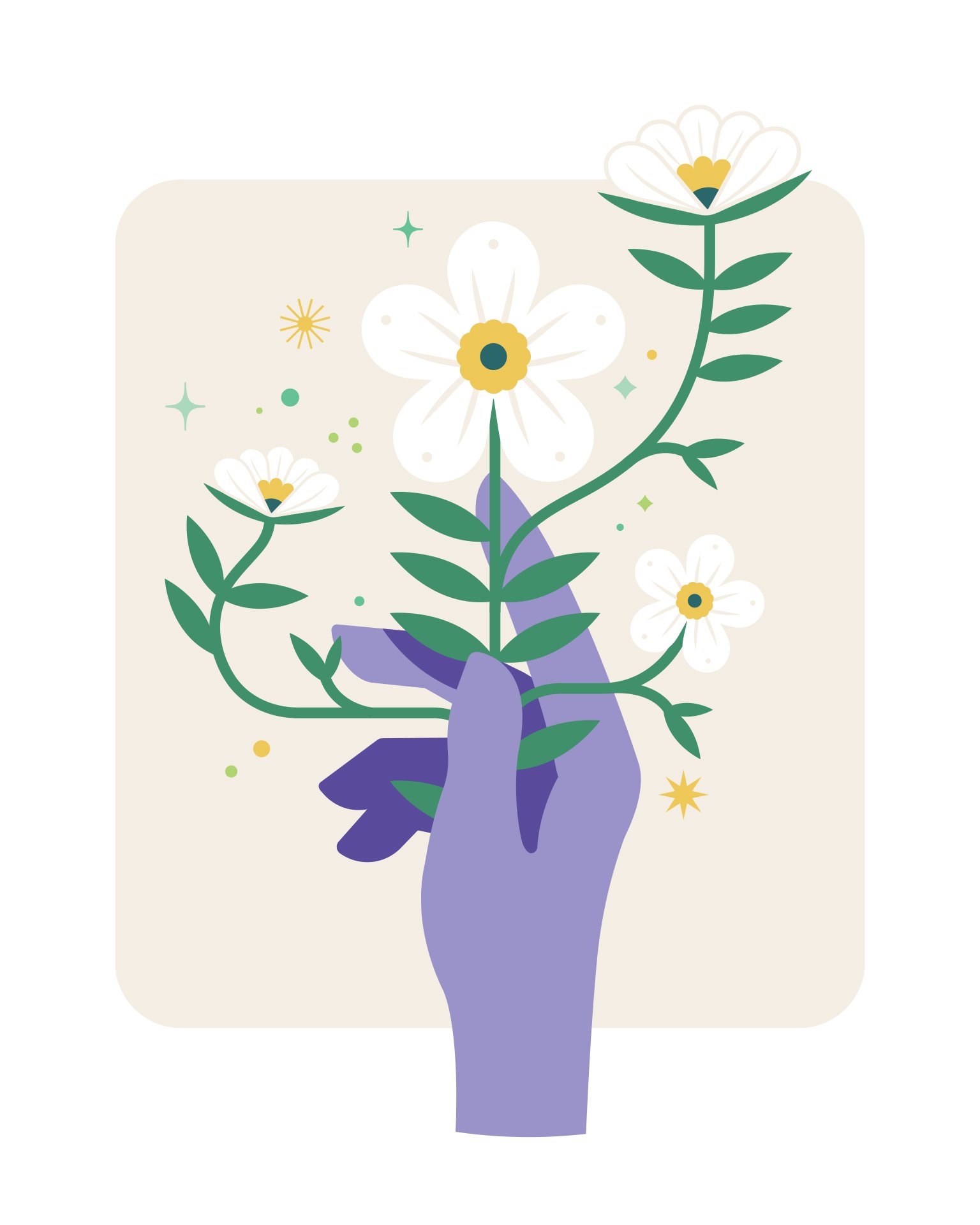
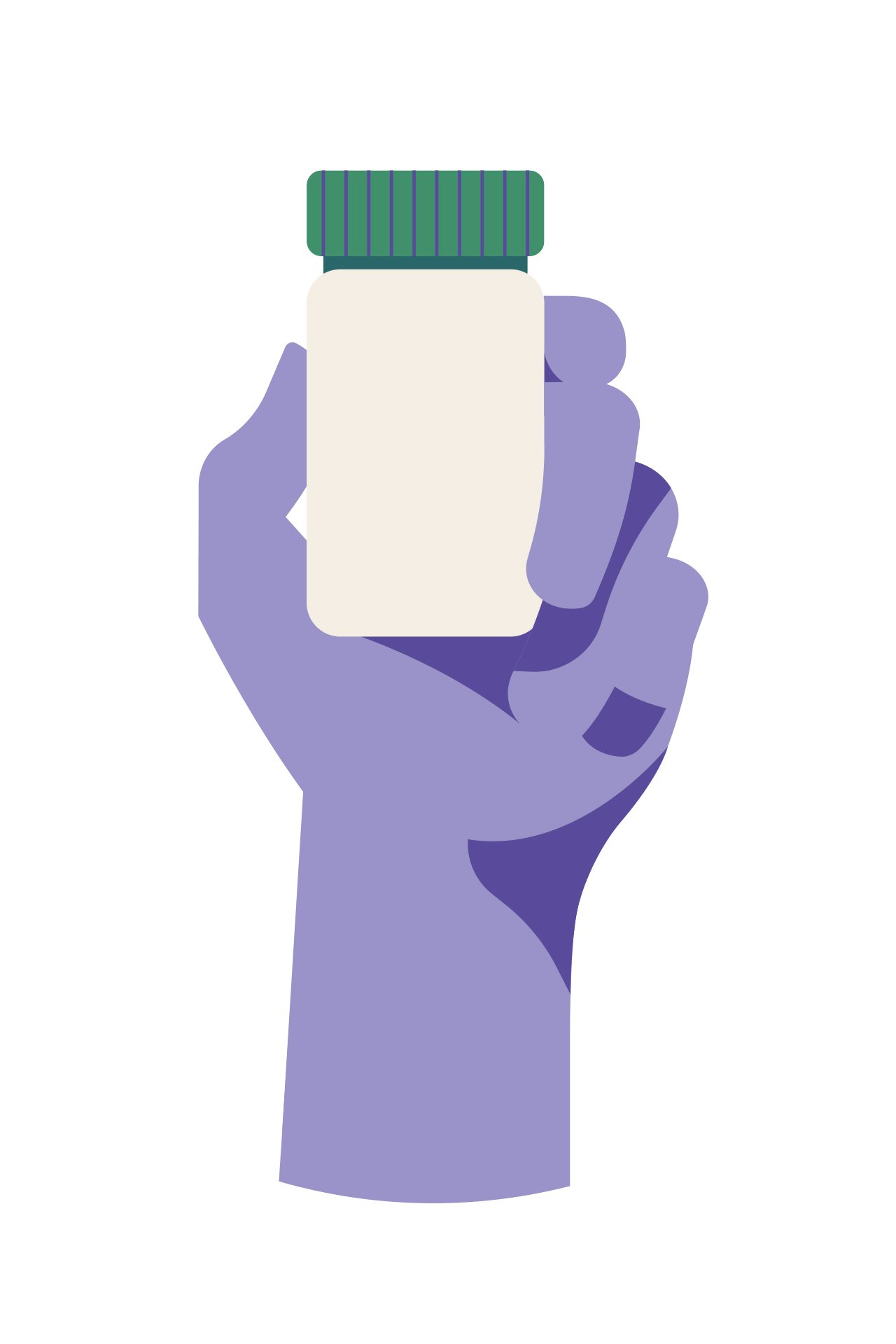
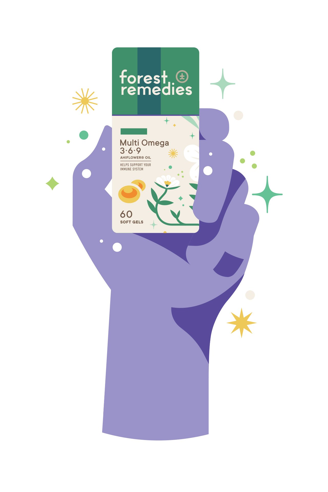
JOLBY
Good times getting to “Ride the Weird” (and in this case, the pretty darn adorable) with the PNW pros at @jolbyandfriends. Such a pleasure working with this crew! Here’s the collection of illustrations I got to make for Forest Remedies based off of Jolby’s groovy art direction. Super grateful for the opportunity. Enjoy!

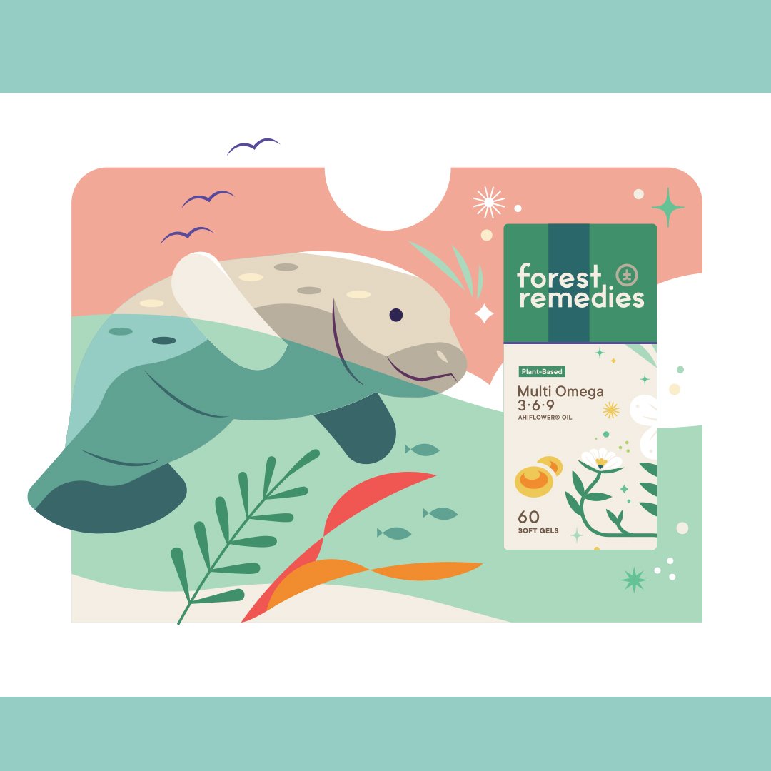

“Collin is a blast to work with! Mega talented, has a detailed eye, and is always surprising us.”
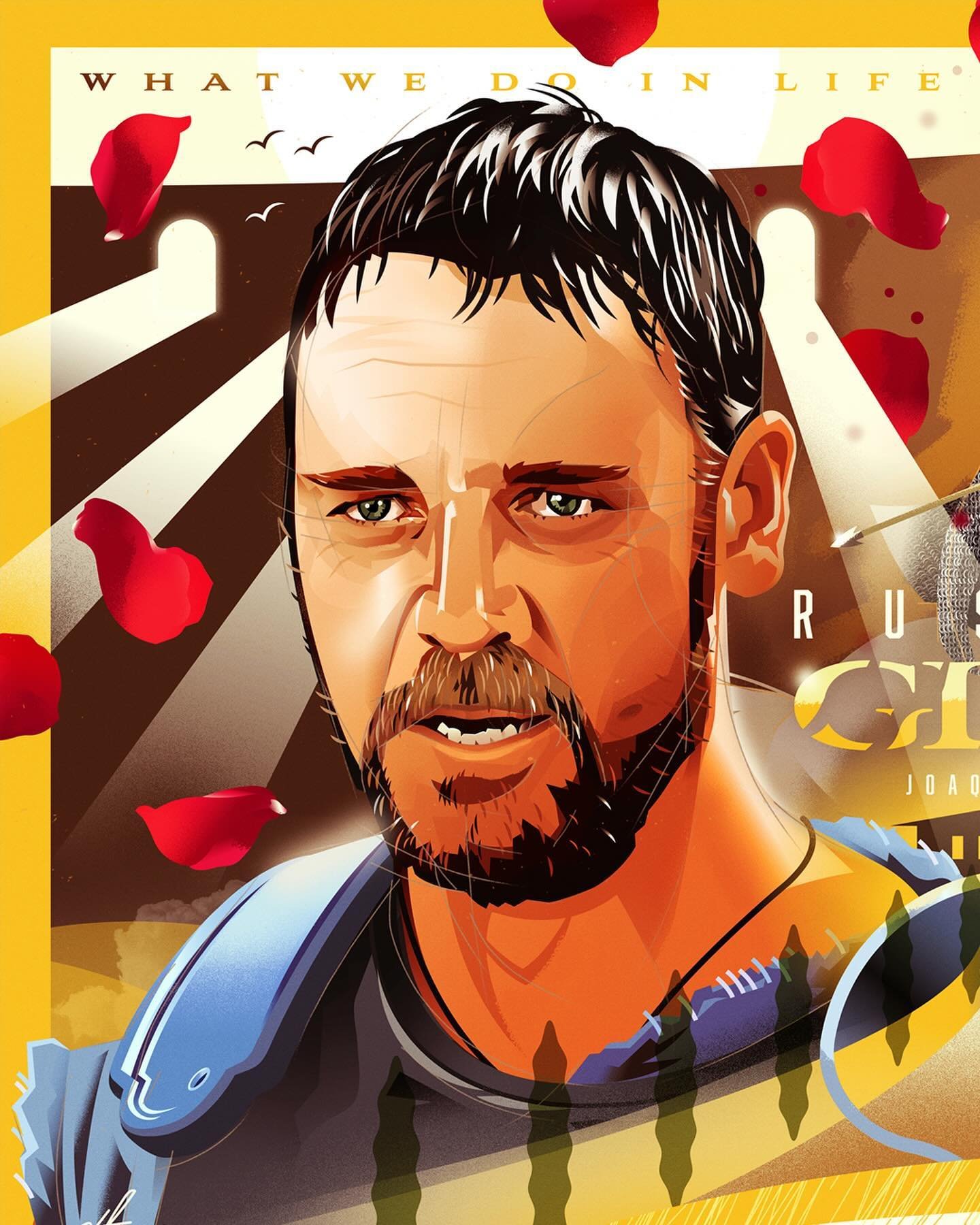
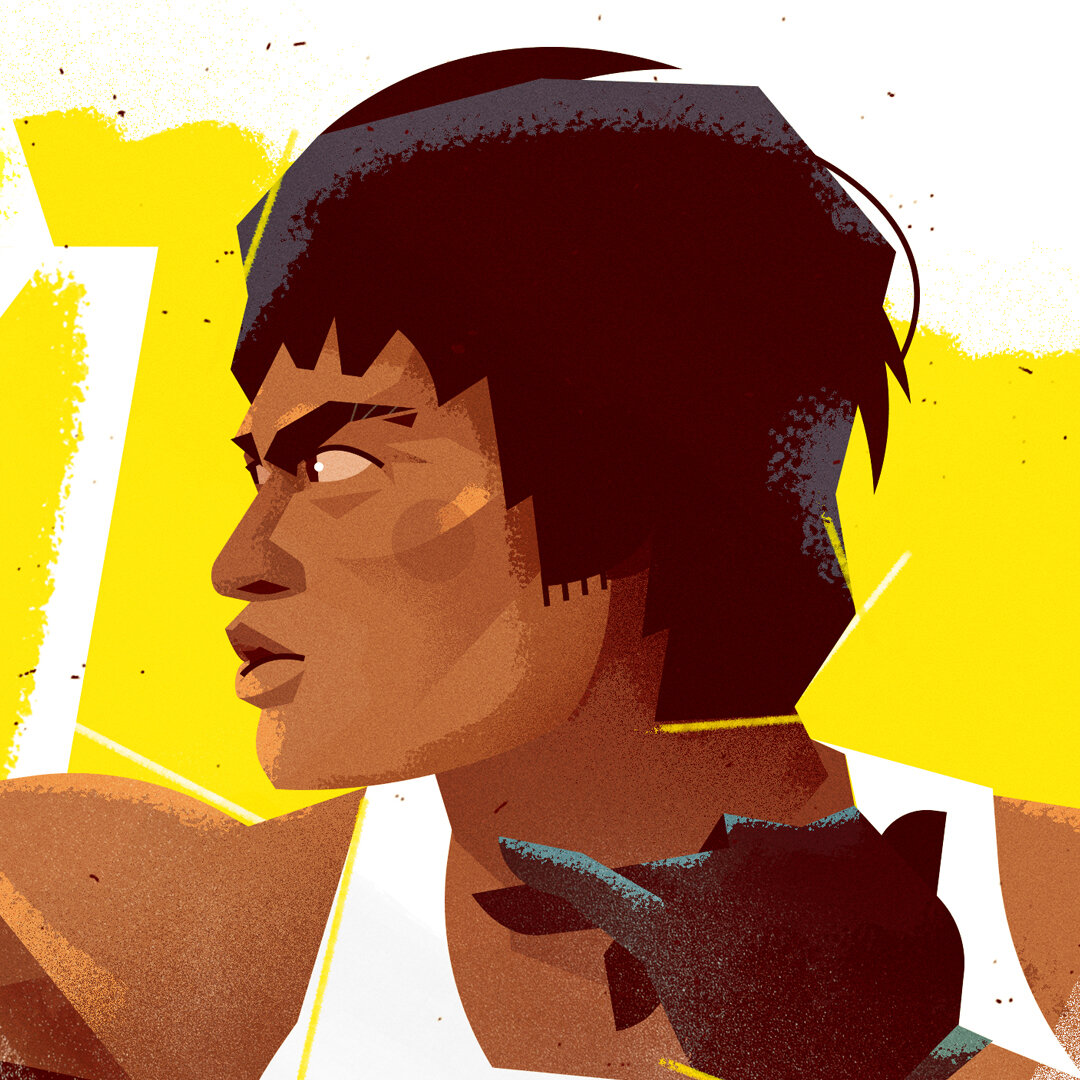
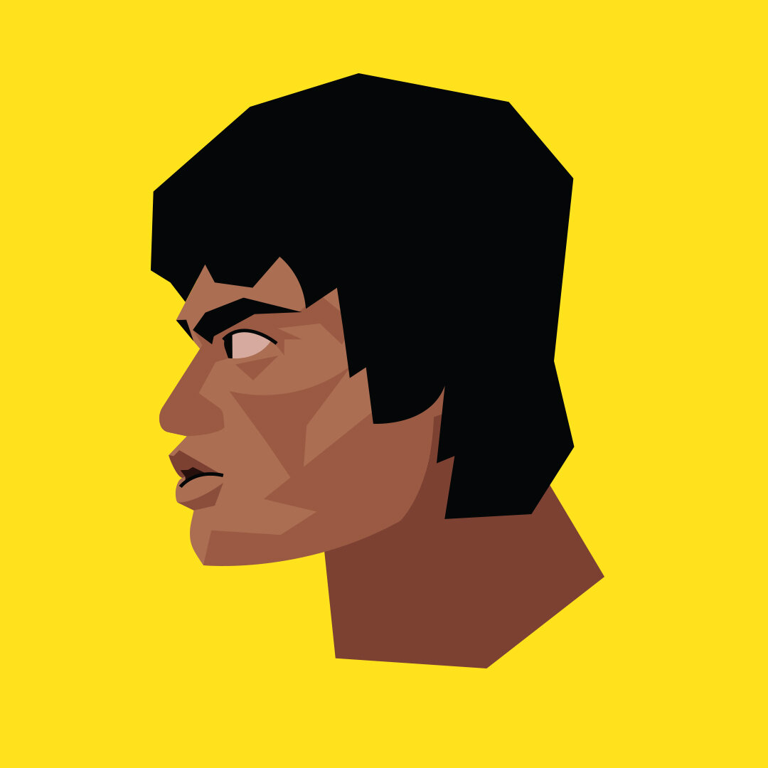
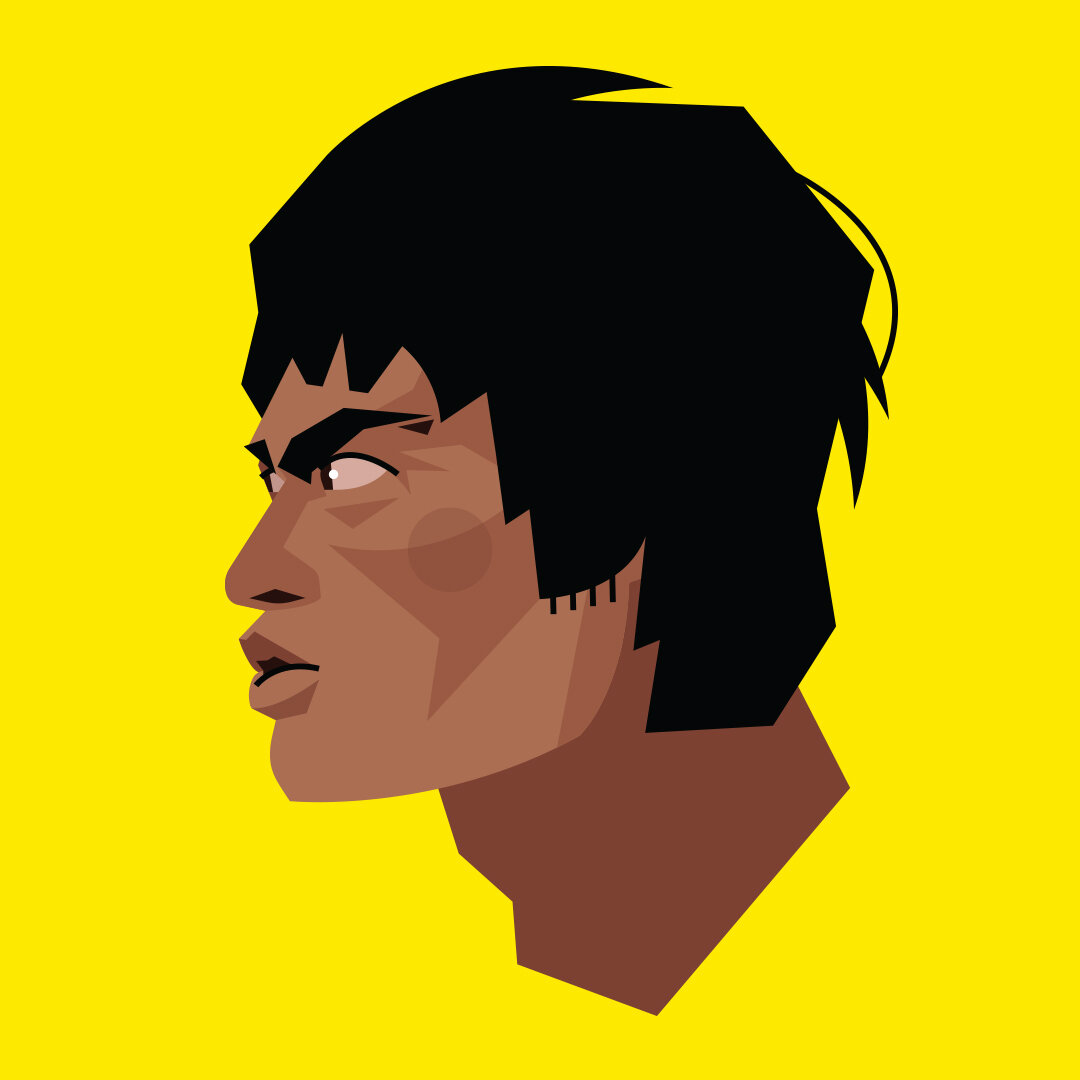
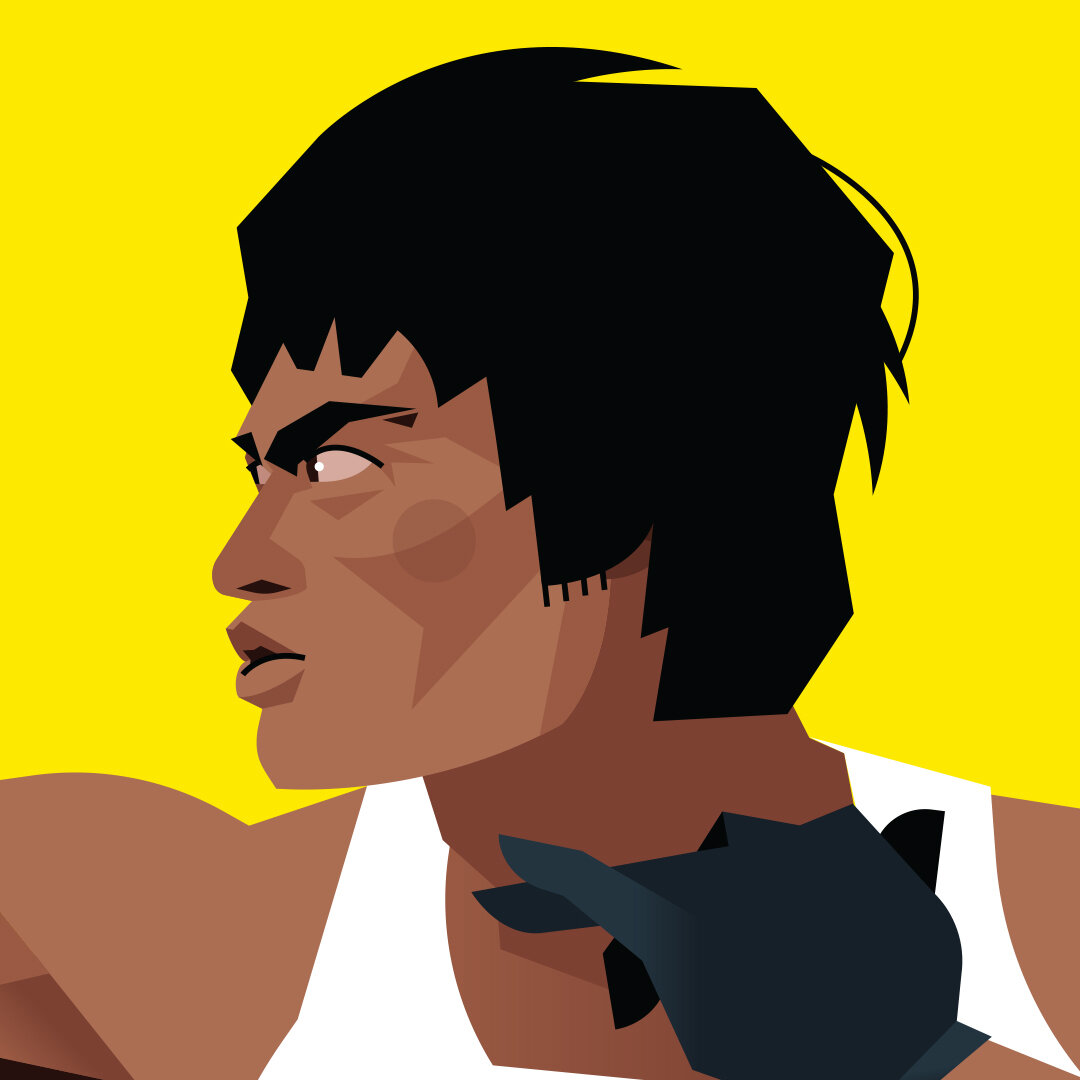
“Champions" : The Year-End Movie Forum
For this custom movie ballot commission, I got to illustrate my favorite scene from “Once Upon A Time…In Hollywood” (written/directed by Quentin Tarantino at his controversial and creative best) featuring The Dragon himself in a “friendly contest” against stunt man Cliff Booth (Brad Pitt at the top of his game in an award-winning performance). This was a fun way to deliver for Jared’s annual event at the Omaha Alamo Drafthouse, and honor two Hollywood Champions in one sweep.
I’ve always admired Bruce Lee for his mad skills and iconic screen presence. But after digging into the R&D for this piece (I chose to use photo refs of Lee himself instead of Mike Moh, the pro who stepped in as Bruce in Tarantino’s “...Hollywood”), I now know just how special he truly was. “Be water, my friend.”
The Mummy in the background is an homage to classic Hollywood films, and is also a prop in the background of the film’s fight scene.


THE MESSENGER - PT. I & II
This project tells the story of Christmas and Easter in a unique way and awakened my love for illustration. Tap the button below to experience “The Messenger”.
Self-initiated Instagram Promo Slider Design (Above)
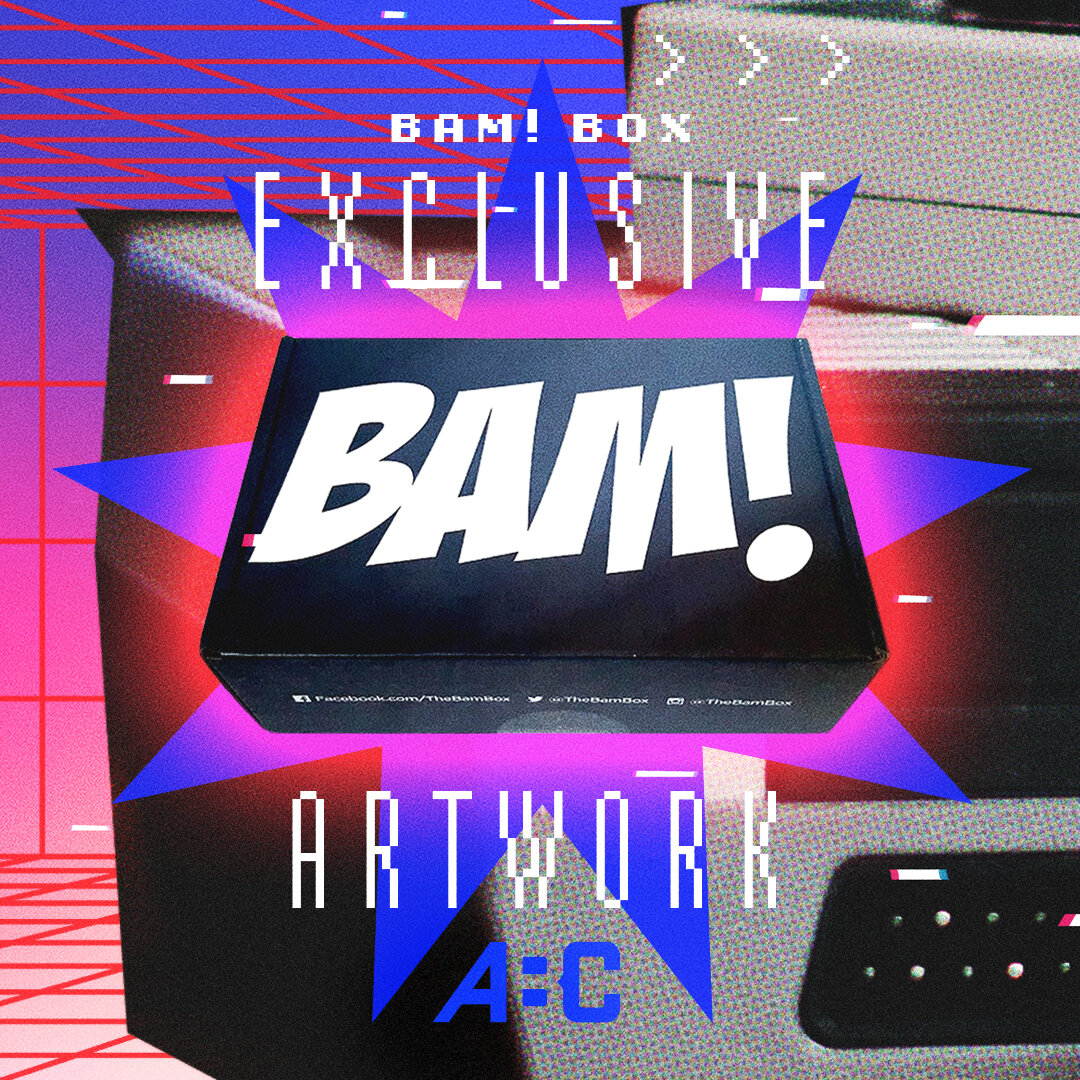
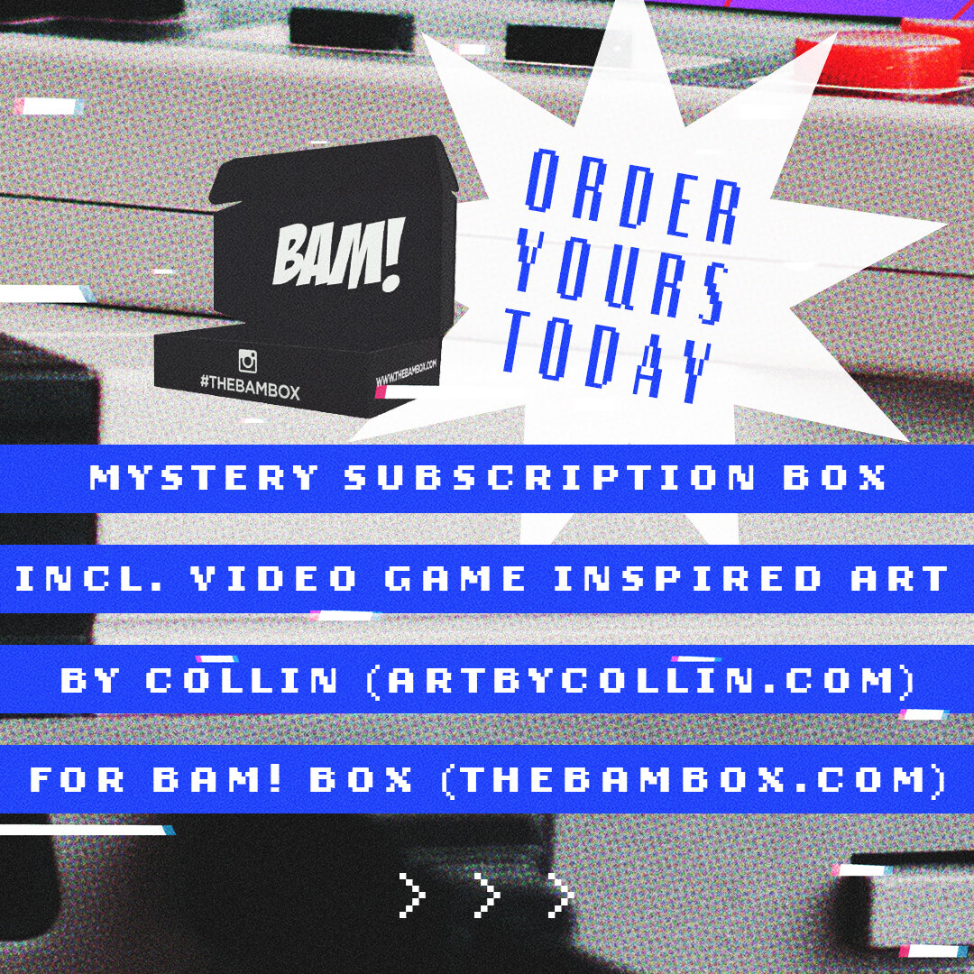
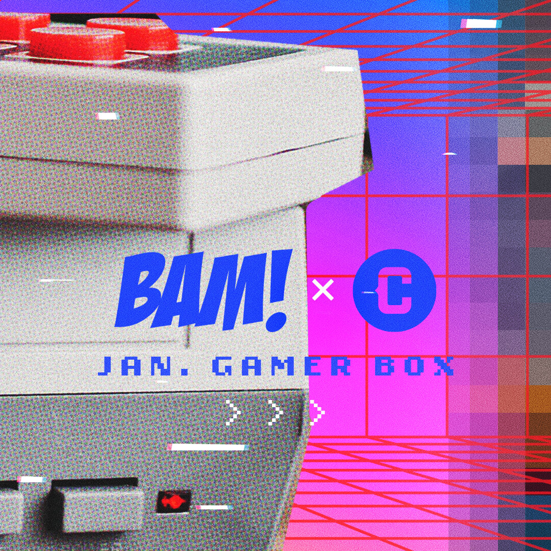
“Outmatched By Dragons”: Gamer art for The Bam Box
Such a blast to illustrate my take on Jimmy & Billy Lee of the classic “Double Dragon” video games for @thebambox! BAM wanted to see the bro’s boss up against “Abobo” for their Gamer-themed gift boxes that went out in January 2021. Say less.
Like the “Jak and Daxter” vinyl I had previously illustrated and designed, it was an awesome opportunity to dig into a popular property that I knew of, but still had to research to get right for the die hard fans of the games. This one’s for you!
Thanks for the rad opportunity BAM! Let’s play again. Game on!
I also documented the experience of signing 2,700 prints of this artwork for their boxes. Tap here to check it out on my Instagram!
This working cover didn’t make the cut in the end, but it inspired the art direction for the rest of the chapter illustrations above! I still have a soft spot for it, and the front/back inside cover concepts (right).
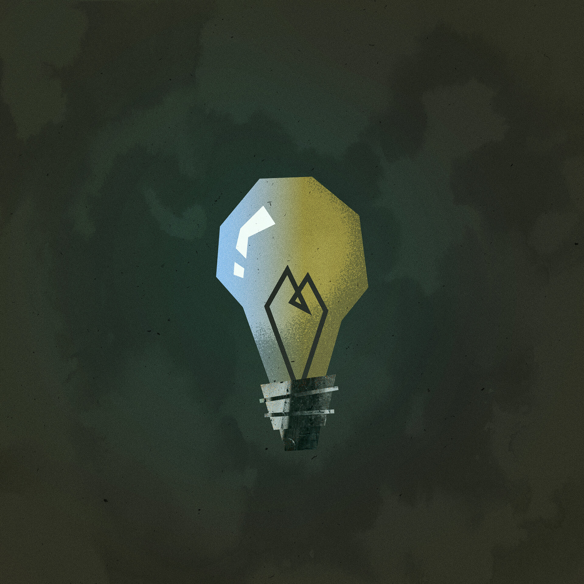
The “Toes, Heart, Mind” light bulb icon (upper right) was a bonus idea that I had for Chuck to include in the book, but he liked it so much that he used it for the final cover and promo materials!
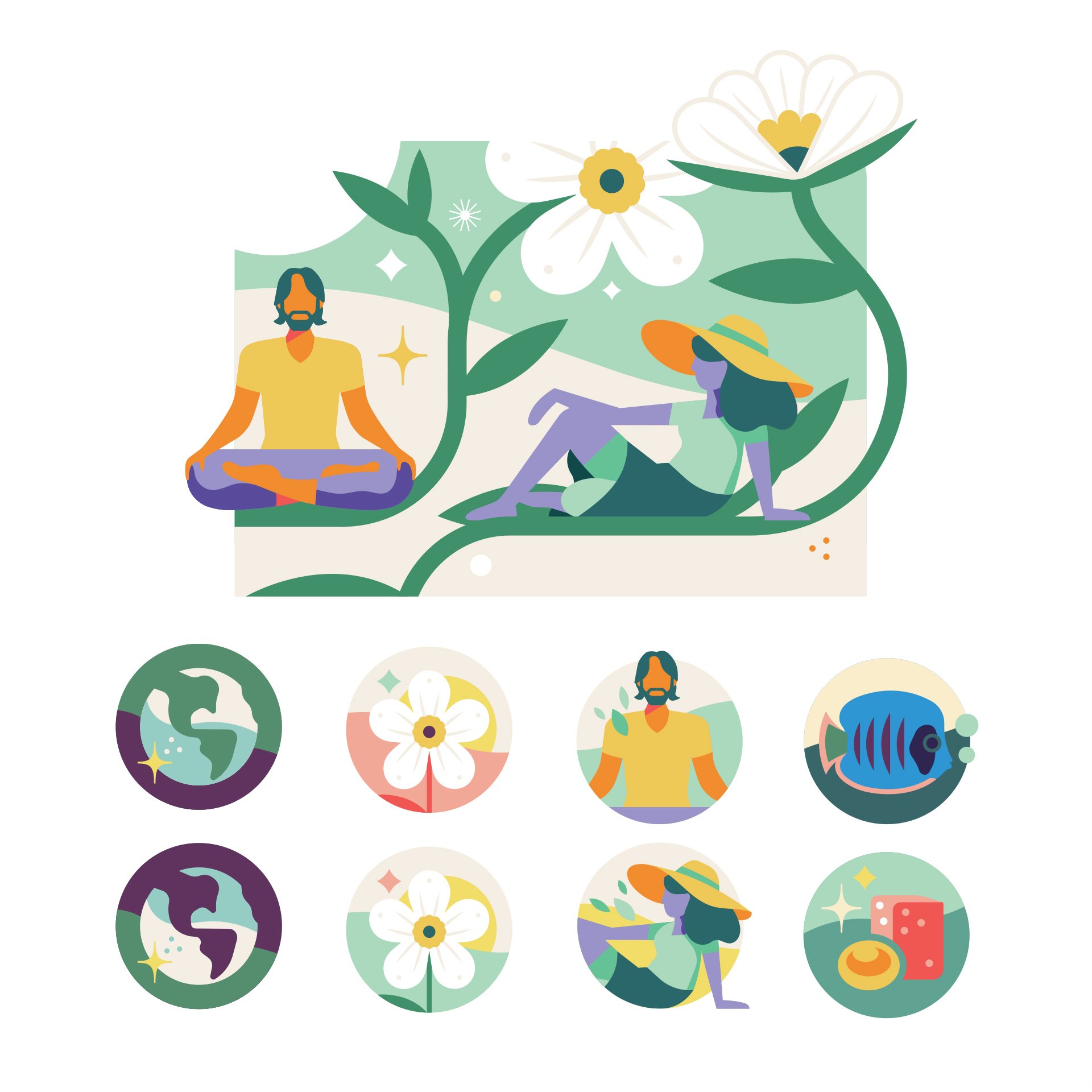
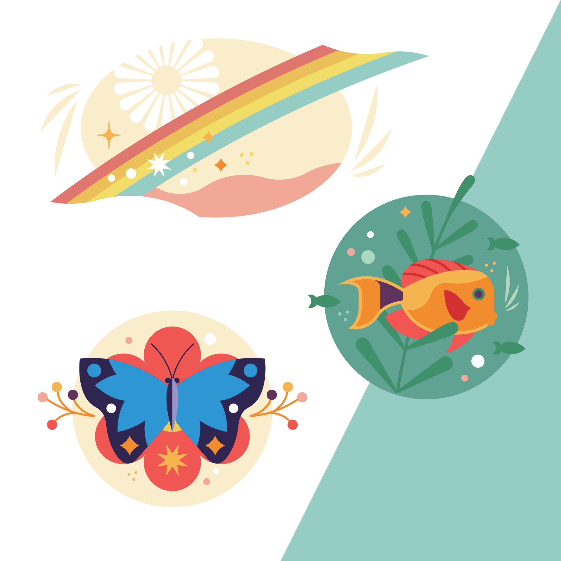
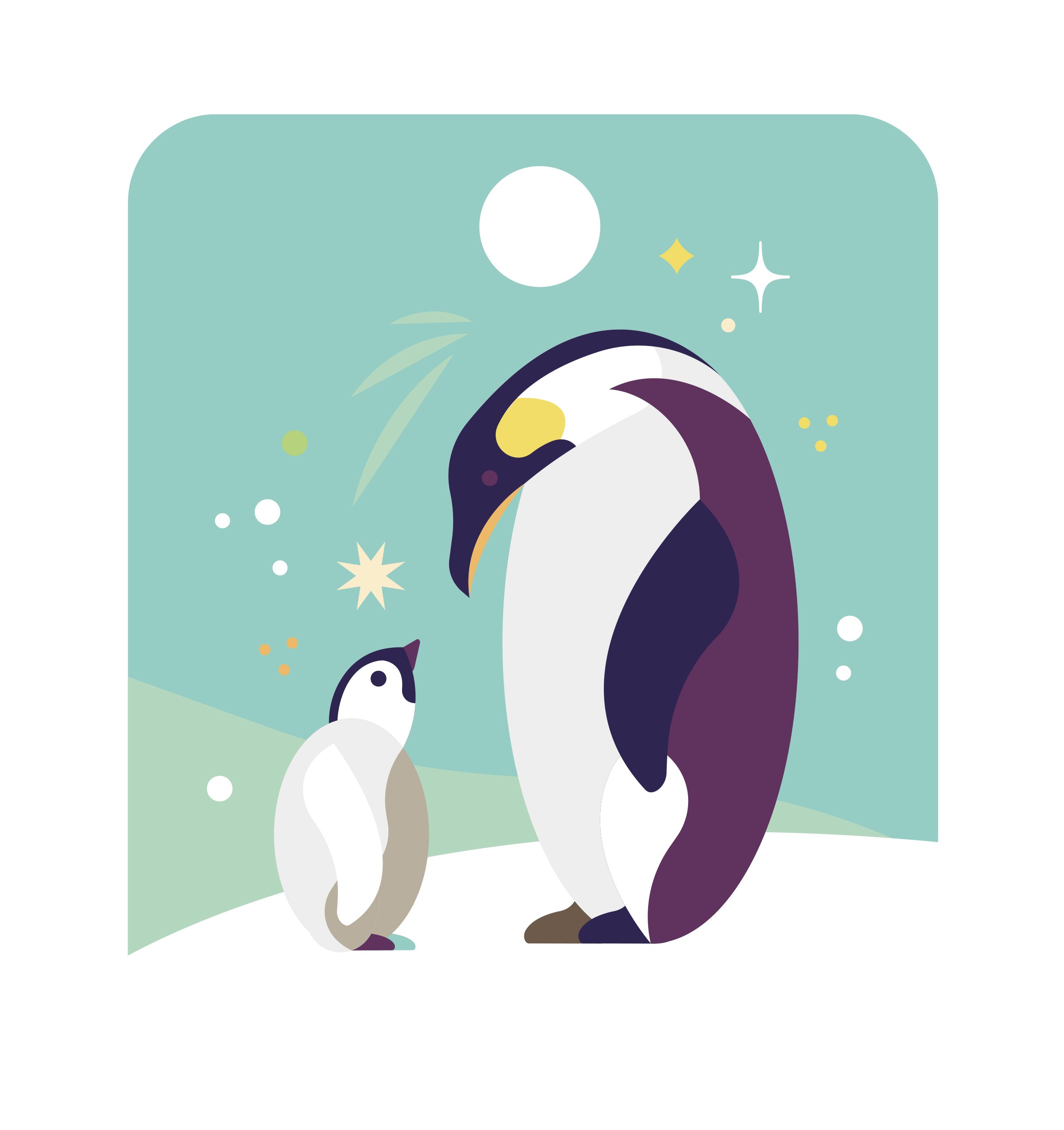
TOES HEART MIND
Here are the illustrations I put together in early 2018 for a book project I got to work on called "Tickle the Toes, Touch the Heart, Change the Mind" from branding and marketing expert, Chuck Mefford (shown far left, next to me, for our bio artwork!). Be sure to check out his insightful YouTube talks. So grateful to Chuck for the awesome opportunity that helped to launch me into freelance illustration.
“I hired Collin to do the artwork & illustrations for my 3rd book, “Tickle the Toes, Touch the Heart & own the Mind”. They were simply awesome! Probably one of the most skilled artists I’ve worked with over my 40-year career in marketing! He really made the book a work of art and my best seller. I only work with people with great hearts, Collin is one of those special people.”
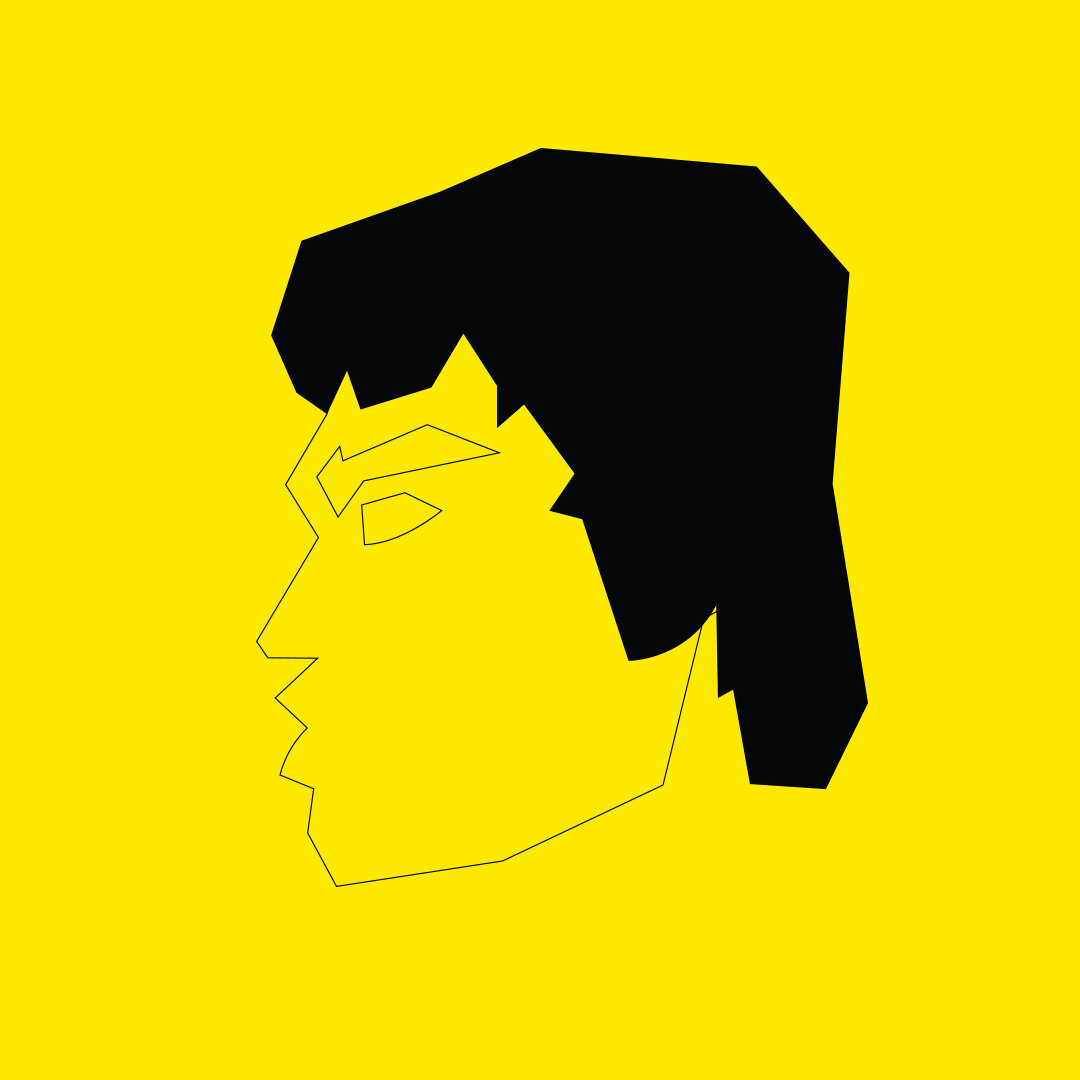
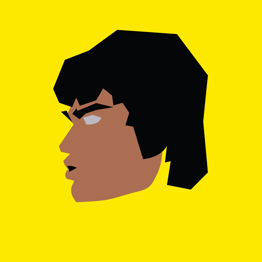
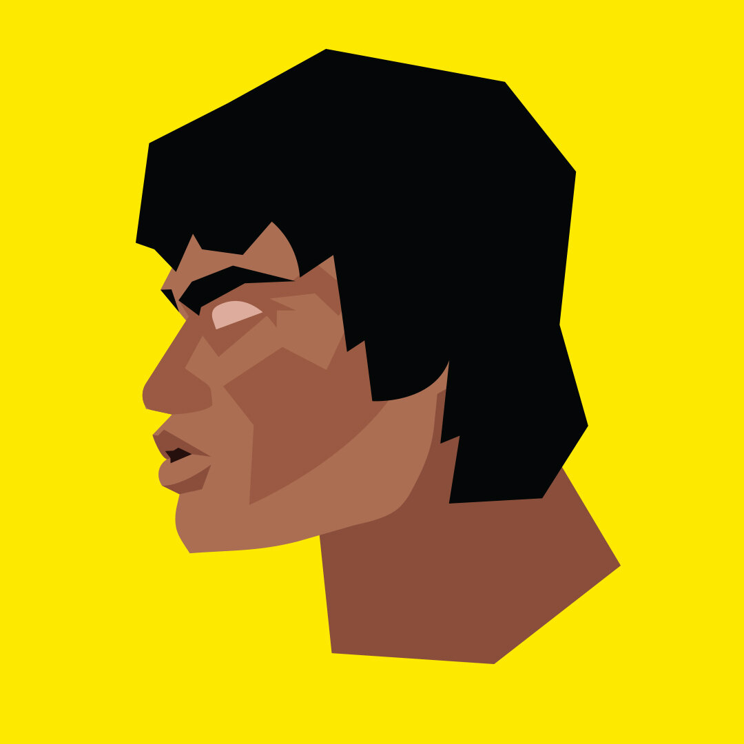
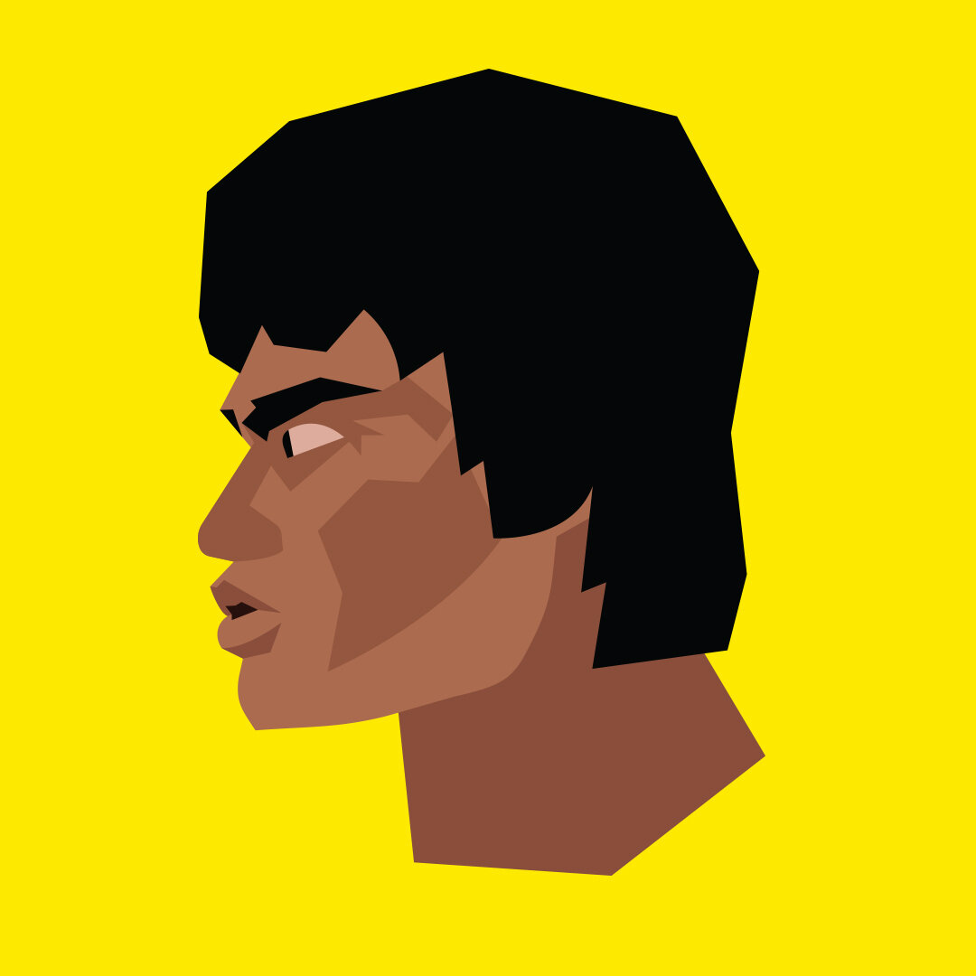
Aaron James Draplin (Draplin Design Co.)
So this happened. One of my absolute favorite Graphic Designers, and my new Oregonian neighbor, Aaron James Draplin hired me to illustrate his portrait for some upcoming DDC promo materials! And just for kicks, I also threw in an extra “bonus” portrait (“Neon” / right) that I created while feeling out the approach for the final illustration (“Orange 021” / above). So fun!
As it goes for every client, it was awesome to partner directly with Aaron, receive and implement any feedback he had for me, and push myself during the creative process so that I could honor him with some artwork that we’re both excited about.
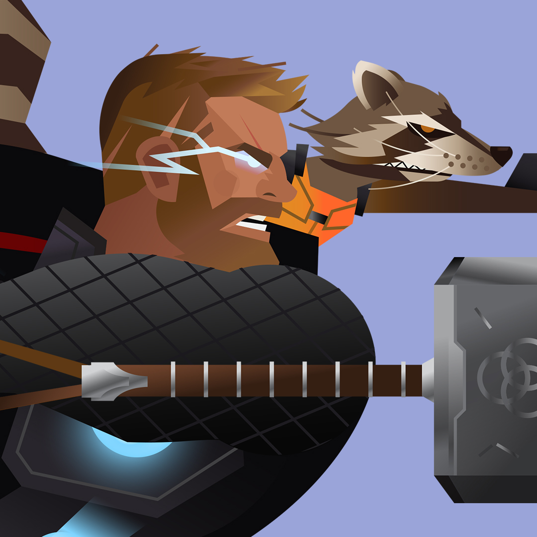
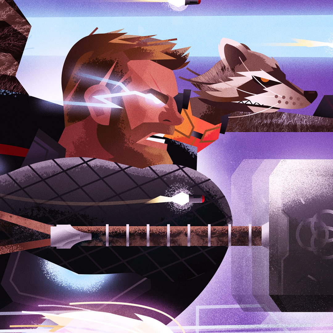
The Gauntlet

This is an AbC Custom Commission for a buddy of mine that I met at the Portland Night Market! He wanted to see heavy-hitting characters from the MCU (Marvel Cinematic Universe) created in my style. ‘Nuff said. ;)
He needed a good chunk of wall space covered, so I suggested a 4’+ triptych concept (three 16x12” standalone pieces, all working better together in a side-by-side scene). He loved the idea - and off I went. This project came at the perfect time too, since Marvel’s “Endgame” just released in theaters and blew everyone’s mind.
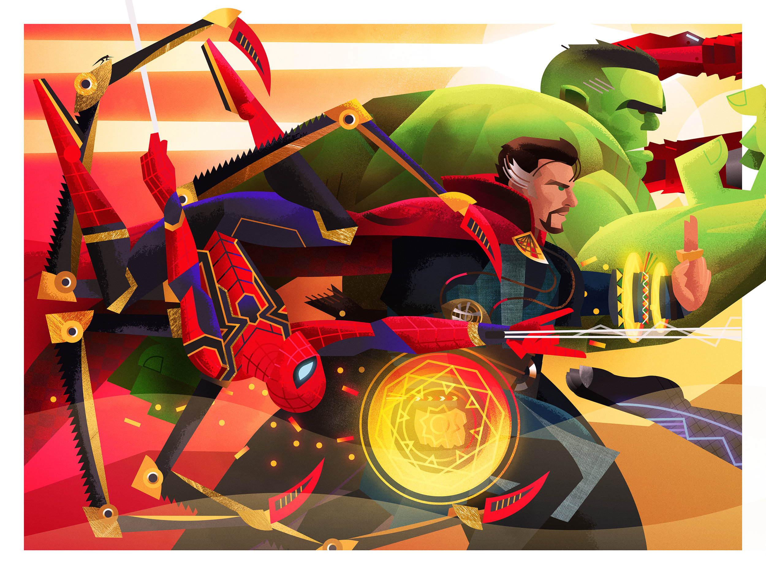
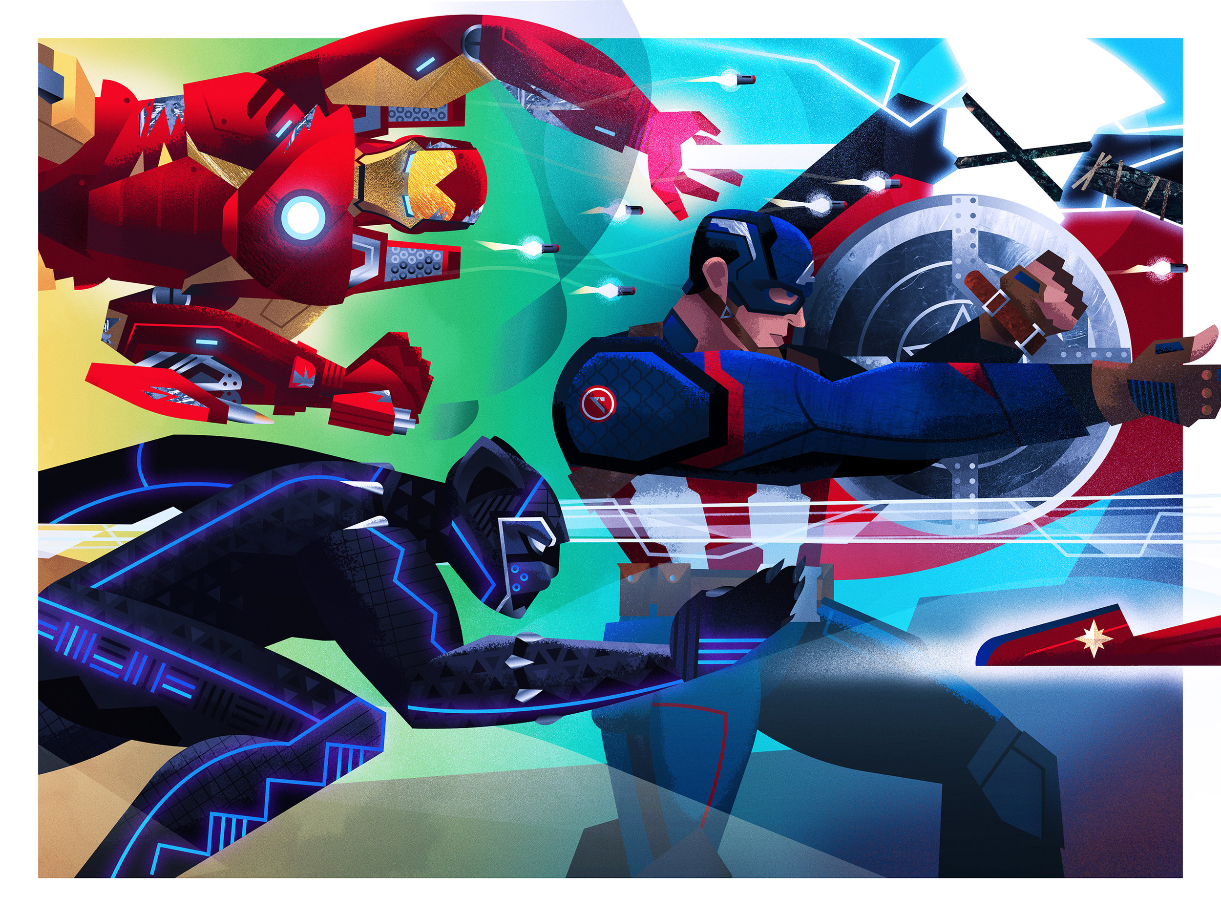
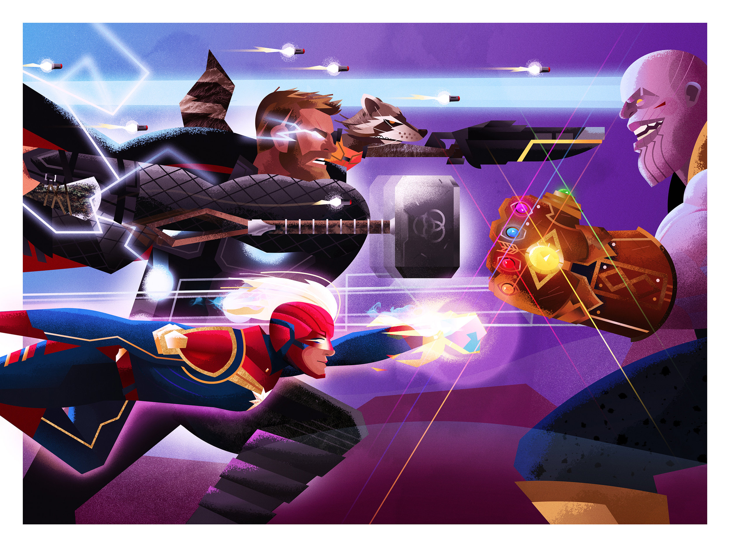


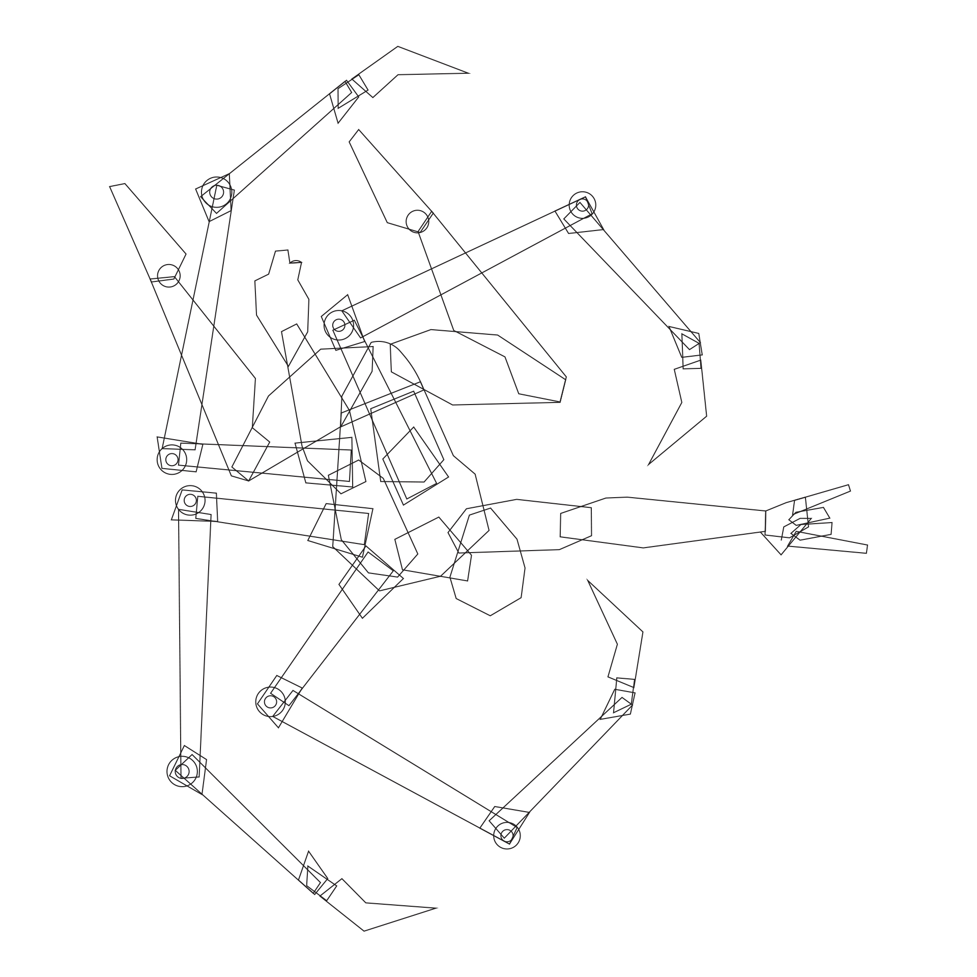
I also took the opportunity to stretch myself with this project by sharing my illustration process, beginning to end, in “real time” with my Instagram audience (see my “digital sketch” below that kicked things off)! It was refreshing do so - since it was way out of my comfort zone :). But as I rigged up my iPhone and filmed some videos, shared plenty of spontaneous and interactive progress with Instagram stories, and posted teaser illustrations of the characters as I went, it was fun to invite people along for the ride. “Assemble!”
Instagram Character Progress/Process/Preview Images (Below)


Prints of “The Gauntlet” triptych set are currently available here! If you’d like to partner together on a Custom Commission, you can reserve a spot in the shop, or contact me! Either way, I’d love to hear your idea, and let’s chat about making it happen. Excelsior!
Just Keep Playing
This album art (and this Yule Tide B-Side illustration) for Justin Smith-Williams were great opportunities to play around with the nostalgic inspiration that lights us up. Check out more design for the album (including sketch concepts) here!

Beast Donuts
No tricks, all treats for this concept project for Corwin Beverage. Each of these icon illustrations represents a tasty donut flavor. I had a blast digging into the R&D for this one :). Check out an expanded look at the logo/branding design here.

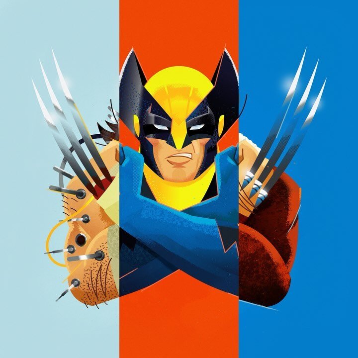
Tekko-Kagi
My buddy’s daughter is stationed in Japan, and she happens to be a giant Wolverine fan, and had a birthday coming up — so he wanted to get her something special. No sweat. Let’s dig deep into the Logan lore for this one of a kind gift.
I’ve always respected the history and artistry of Samurai culture (not to mention that I’m a die hard Samurai Jack fan), so the R&D for this piece was a blast. From Kiwagta to Waraji, it was fun to imagine what Wolverine might have worn for battle in 1700 AD, based on authentic Japanese armor and weaponry, and Logan’s classic yellow/blue era.
Bonus Features: “Tekkō-Kagi” are concealed and armored hand blades of the Samurai, and the kanji symbol on Logan’s forearm means “Fierce”. I thought the X built into the symbol itself ramped up the cool factor.
If you’d like to partner together on a Custom Commission, you can reserve a spot in the shop, or contact me! Either way, I’d love to hear your idea, and let’s chat about making it happen. Thanks, Bub.

Poster
The Greatest King
Here’s a fun one for Rolling Hills Community Church! This poster is for an RH Kids teaching series about King David - the Psalmist and shepherd boy who slayed Goliath with a sling and a stone. I’m always inspired by David, and was given the freedom by RHCC to dig into my illustration style (and my influences, along with some great reference material), so this project was way awesome.
Check out another cool project for Rolling Hills here!
Title Screen
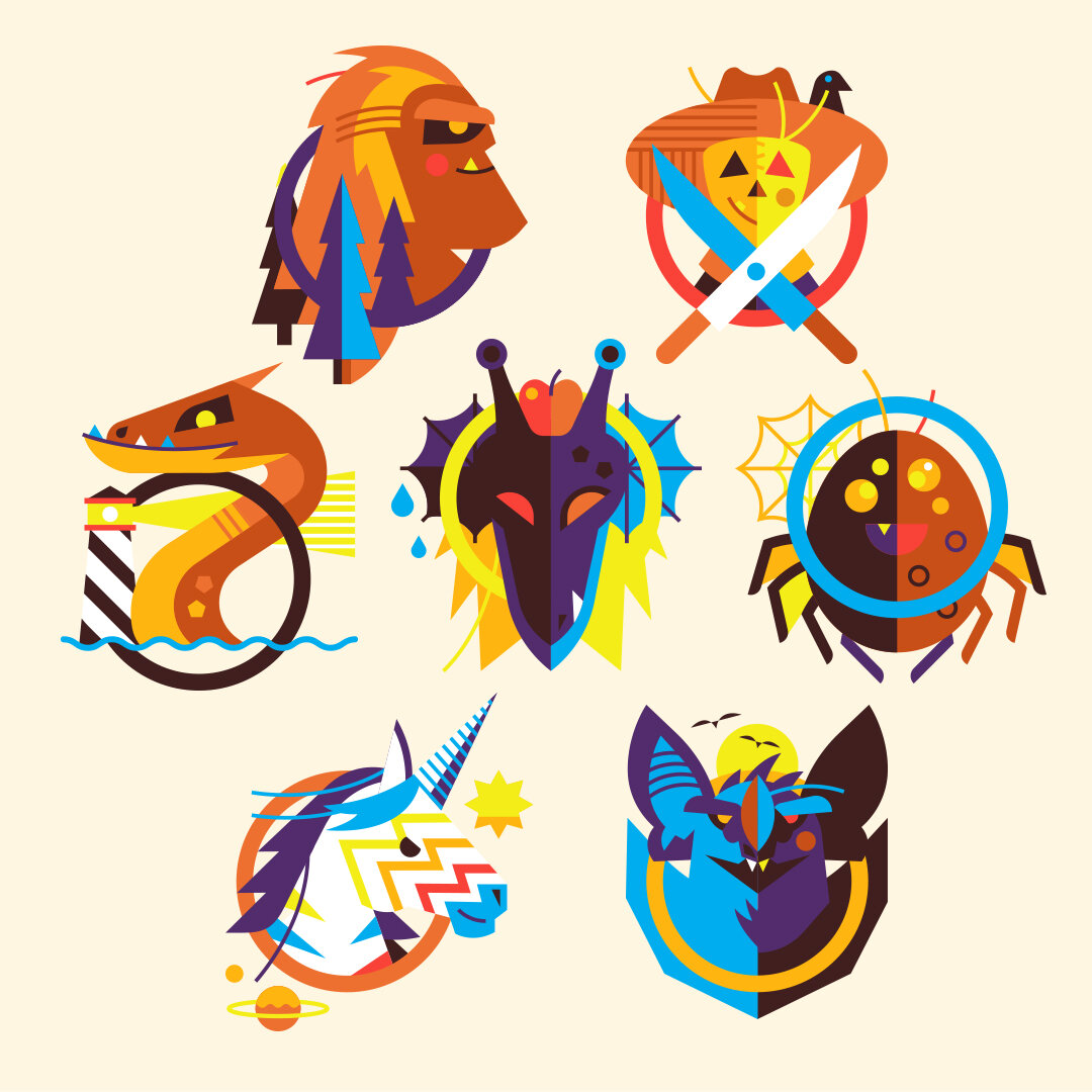
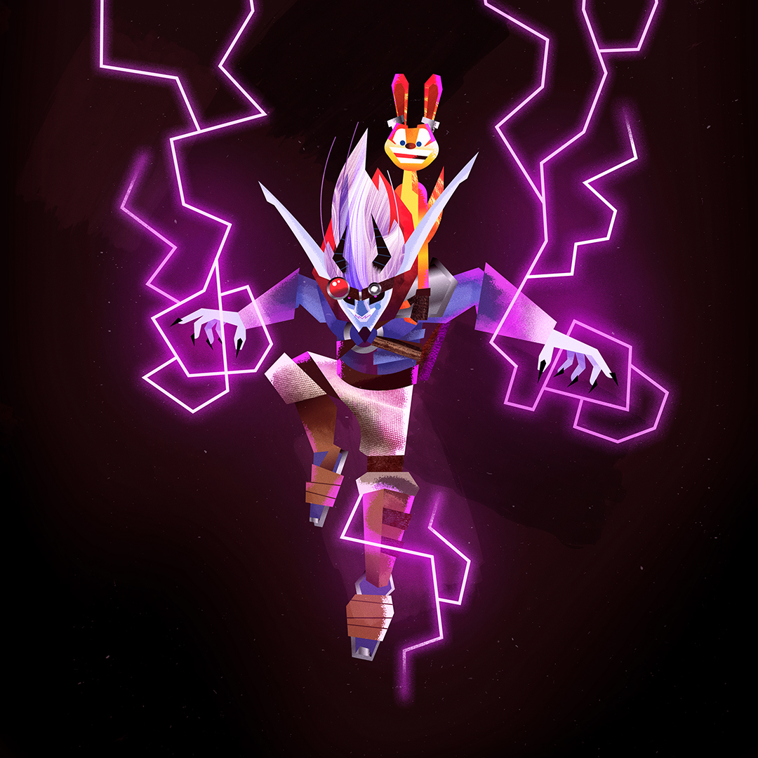
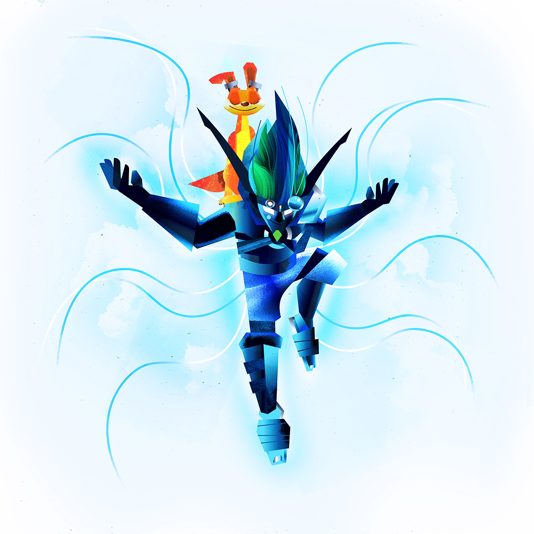
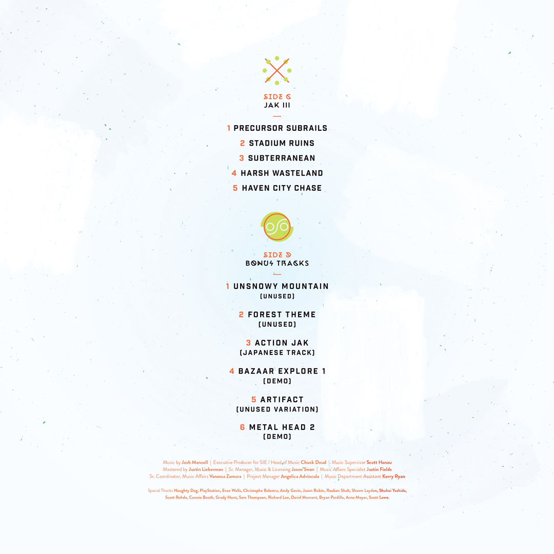
THe “Jak and Daxter” Soundtrack Collection
This vinyl was one of my most challenging assignments, but a total blast to work on from start to finish. With everything you’ll see below, this was an incredible opportunity to stretch my experience in illustration, art direction and graphic design all in one shot!
It was such an honor to partner up with Fangamer, Limited Run Games, PlayStation and Naughty Dog (creators of “Jak and Daxter” and other amazing games like “The Last Of Us” and “Uncharted”). A huge THANK YOU to those everyone involved in the project, and to everyone who snagged a copy! This one is for the True Jak Fans.
Front Cover
2-Panel Gatefold (Above) / Inside Sleeves (Below)
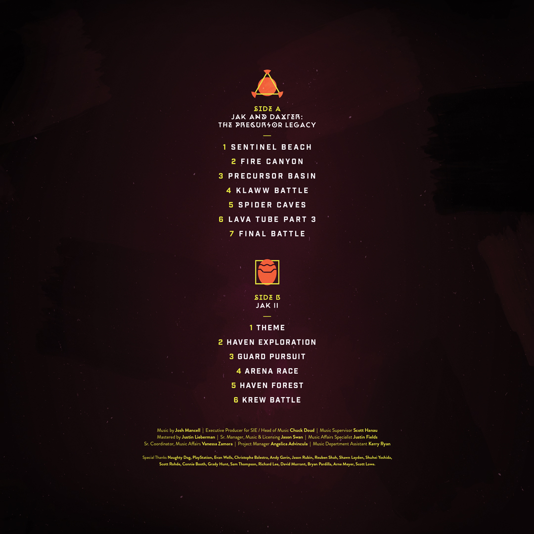
Side A Label - “Power Cell” Icon
Side B Label - “Precursor Orb” Icon
Side C Label - “Green Eco” Icon
Side D Label - “Seal Of Mar” Icon
Back Cover
“[Collin has] been an absolute pleasure to work with. A true professional that goes above and beyond the call. We are absolutely thrilled with the final results.”
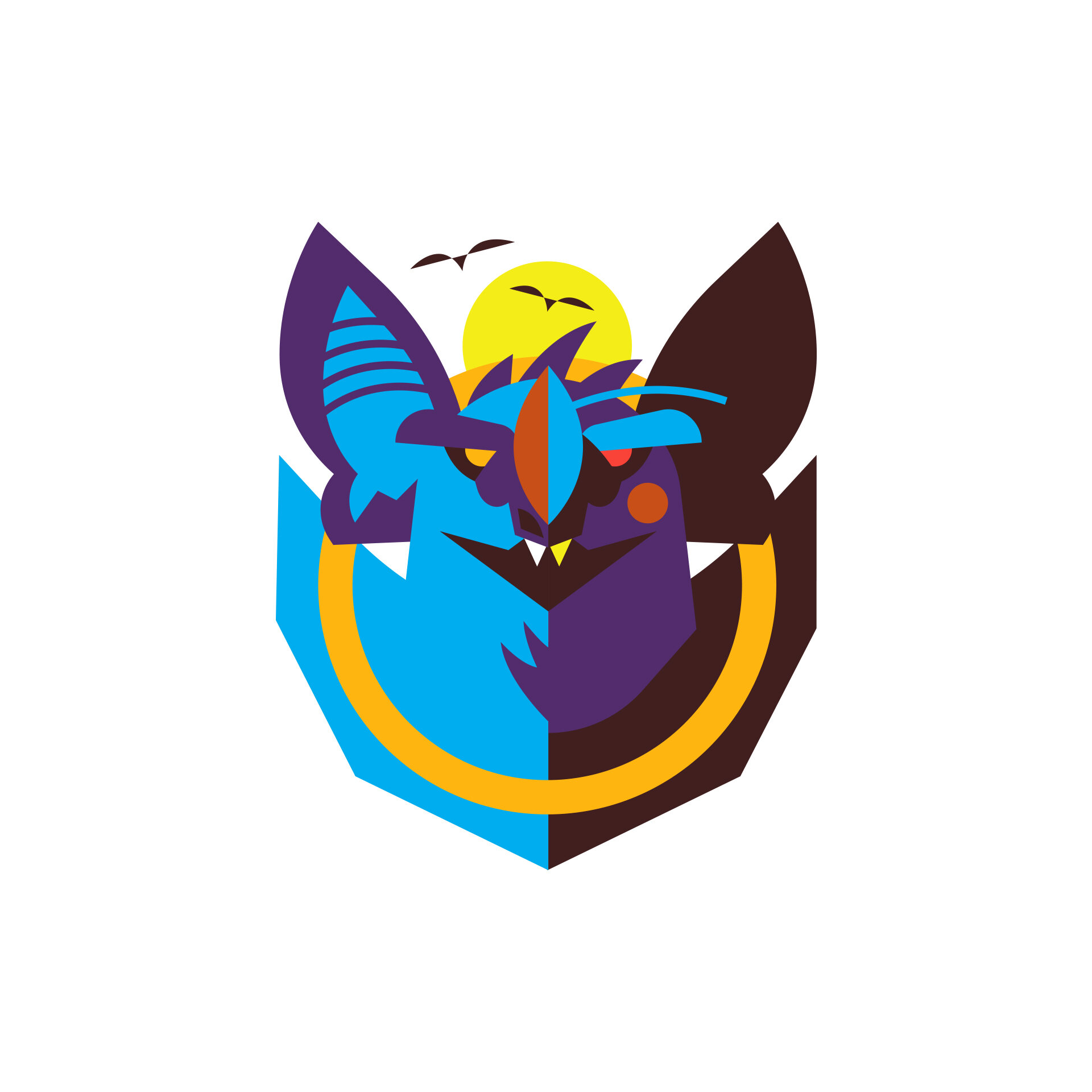
THE DROIDS YOU’RE LOOKING FOR
Ok, this technically isn’t “Client Work”, but it’s a different kind of creative collaboration! These three pieces were created for “Star Wars Day” (May The 4th, 2019, 2020 and 2023) with my buddy Mister Hope. He’s another awesome artist and all around good guy - so partnering up was a natural fit. He handled the drawings, I put my spin on the colors, textures and also spearheaded the art direction. Such a fun challenge to mesh both of our creative worlds (across US and UK time zones) for a couple of unique pieces. May The Force be with you!
“The Droids You’re Looking For” | 2019
“The Droids You’re Looking For (Empire Rebellion)” | 2023
“The Droids You’re Looking For (Offworld)” | 2020
BACK
You can stay up to date by following @artbycollin on Instagram!